Showing posts with label Swatches. Show all posts

Tuesday, July 26, 2011

Sleek Makeup Carribean Collection Aruba Blush: Swatch and FOTD

One of the key trends this summer has been that of orange and coral face colours. Of course, Sleek Makeup has come out with just the thing to indulge your craving for an on-trend cheek colour without breaking the bank! The Aruba Blush, part of Sleek Makeup's Carribean Collection, is the perfect shade of trendy summery orange going on right now. Just look at all that pigment!

Sleek Aruba Blush Carribean

I don't know about you, but I was a bit surprised when I first opened this. I mean, Aruba is perhaps as neon as a blush probably can get! This is easily the loudest, brightest, boldest blush colour I've seen - it would seriously put even the famed NARS shades to shame! Come to think of it, Aruba does kind of remind me of NARS Taj Mahal, although I'm not sure if they are dupes or not. But for a fraction of the exorbitant NARS price, Sleek Makeup's Aruba Blush is definitely in the same colour category, being also a bright orange-based blush.

Sleek Aruba Blush box


I know I've said this before, but I love the design on the Sleek Carribean Collection. Just look at the cute little illustrations of a boat and a palm tree. Feels like summer, doesn't it? Other than the cute design, the packaging is pretty much the same as the other Sleek Makeup blushes, consisting of a sturdy plastic case and a small mirror in the lid.

sleek aruba blush pan


As you can see from the photo above, the colour in the pan looks really scary - I thought it would be too dark or bright or just too neon for me! So I gingerly swatched it:

sleek aruba blush swatch


There, not so bad, right? The blush can be intense, but once blended out it can leave a sheer wash of colour. I'm thinking for warm-toned girls, this colour would look really pretty on. On cooler-toned girls, the orange hue can look a little weird, since the shade clearly leans warm, but if blended out, can still be wearable. After all, orange is one of the hot shades this summer.

Finally, I worked up the courage to actually try it out on my face:

sleek aruba blush fotd


There, it wasn't half as bad as I thought! When sheered out, it can definitely be used on paler girls as well. I think good application and blending is key - you definitely want to use only a little bit at a time, and blend it well. Given how little I used, I think this blush is going to last me forever, making it really great value for money.

If you're looking for a trendsetting colour, and want something cheap, or just want a more affordable version of NARS Taj Mahal, this is definitely worth checking out. If good-quality pigmented blushes are your thing (and they're definitely mine), the entire Sleek Makeup range of blushes in general would definitely be your cup of tea too.

(Product was sent for review. Review is my complete and honest opinion. I am not affiliated with/compensated by the company.)

Tuesday, July 19, 2011

Sleek Makeup Curacao Palette Swatches

The hottest, brightest, boldest palette of summer is here! And it's mine! All mine! Sleek Makeup's Curacao is officially the loudest, brashest set of colour you can wear on your eyes. Just look at all that brightly coloured goodness!

Sleek Curacao Palette

The Curacao Palette is part of the Carribean Collection, out for this Summer. It's supposed to be full of bright, happy, confident colours - like a Carribean holiday! I've never been to the Carribean, but hey, now I can pretend that I'm on a holiday just by looking at the tropical-looking box!

sleek curacao palette 1


Box aside, I'm so glad to see that Sleek Makeup has nammed all the colours in the palette - previously their palettes didn't have colour names, so I think this is pretty cool. Coming from Singapore, I especially love that there's a hot magenta pink colour called Singapre Sling - I know it's named after the cocktail, and not the country, but hey, it's still cool, right?

sleek curacao palette 2


1st Row, L-R: Tequila Sunrise (warm russet orange, shimmer), Martini (shimmery light neutral beige), Blue Hawaiian (a pale but bright blue-green aqua), Bloody Mary (matte primary red), Screwdriver (bright matte crayon yellow), Green Iguana (shimmery deep forest green)

2nd Row, L-R: Apres Midori (shimmmery yellow grass green), Blue Lagoon (matte light aqua blue), Purple Haze (deep matte grape), Green Martini (shimmery deep olive green), Singapore Sling (shimmery hot pink), Espresso Martini (matte black)

My favourite shades out of the palette are Blue Hawaiian - it reminds me of China Glaze's For Audrey, but in eyeshadow form! I think if I ever did my China Glaze For Audrey manicure again, I can totally wear Blue Hawaiian to go with it! I also love Green Martini, because it's the perfect deep shimmery olive green with a great deal of complexity.

And here's a shot of the colours without the plastic sheet over it. Aren't the colours gorgeous?

sleek curacao palette 3


And of course, what kind of blogger would I be if I didn't offer you swatches, so here you go! Swatches of the Curacao Palette!

sleek curacao palette swatch


As you can see, the palette has pretty good pigmentation and texture, much like the other Sleek Makeup palettes. However, I did feel like the shimmer shades were softer and a bit more pigmented than the matters, like other Sleek palettes I've tried. If you've liked the previous palettes produced by Sleek Makeup, you'll definitely love the Curacao Palette as well, as the formula hasn't changed - this is pretty much the same thing, but with a zing and a zest in the bright shades!

Over the next few days, I'll be producing a few eye looks with the Curacao Palette, so do keep a watch out for those - I'm pretty excited about the wide variety of looks this little baby can produce, and I can't wait to share them with you!

(Product was sent for review. Review is my complete and honest opinion. I am not affiliated with/compensated by the company.)

Saturday, July 16, 2011

Canmake Shimmer Jelly Eyes Cream Eyeshadow Swatches

Canmake, the Japanese drugstore cosmetics brand, typically produces ranges of products aimed squarely at the Asian market - with tons of shimmer, frost, and cutesy packaging, the brand does not deviate much from the typical formulas used to appeal to Asian consumers.

With Canmake's range of cream eyeshadows, the Shimmer Jelly Eyes Cream Eyeshadows, these are slightly different. The Shimmer Jelly Eyes, as the name suggests, are full of shimmer, but most colours don't have many visible specks of glitter, just frosty shimmer.

Image from http://bobodave.com


Here are swatches of the products. Look ma, almost no huge bits of glitter, just tiny ones! The frost is still there though, as is the somewhat weaker pigmentation I tend to find in Asian brands.

Canmake Shimmer Jelly Eyes Cream Eyeshadow Swatches

01 White Frosty is a sheer white frost
02 Sugar Milk Tea is a light tan brown, also frosty and sheer
03 Strawberry Parfaiit is a sheer, shimmery, pastel pink
04 Frozen Melon is blue-based pastel green. Doesn't look like the colour of a melon at all, but a very pretty aqua blue-green.
05 Caramel Chocolate was a rich, deep, chocolate brown. This is the least glittery of the lot.

My favourite out of the lot is 05 Caramel Chocolate, because it has the best pigmentation, and the least amount of grittery glitter. Most of the shades are sheer, and have tiny specks of glitter, especially the lighter colours. I really liked that the shadows started off with a fluid finish, but dried fast. After leaving them to set for 5 - 10 minutes, I found that the colours stayed on and did not remove easily. But if rubbed hard, these could be removed, so if you have a habit of rubbing your eyes, this isn't a great choice for you. However, if you don't rub your eyes, chances are this would last pretty decently on you.

Tuesday, July 5, 2011

Benefit Coralista v Bella Bamba: Comparison Swatches

Ever since I featured Bella Bamba on my blog, I've been meaning to swatch it next to Coralista, just to show the difference between the two. So finally, after much ado, here are comparison swatches!

Benefit Coralist Bella Bamba

Bella Bamba was released early this year, and Coralista was released quite a while back - possibly a year or more ago. Benefit seems to have cut down on the amount of product product they give in the blushes though. Coralista gives you 12g/0.42oz of product, Bella Bamba gives you 8g/0.28oz of product. That's like, cutting down the amount of stuff inside by a third!

benefit bella bamba coralista 1


Bella Bamba and Coralista look pretty different in the pan. Coralista is a lot more, well, coral with a side of pink, while Bella Bamba is pink but with just the slightest hint of warmth. Both of them have similar shimmer - small particles of shimmer that aren't too much or unwearable. I guess there isn't really a need to swatch them to show how different they are, but well, here are swatches anyway.

benefit bella bamba coralista swatch


L - R: Coralista, Bella Bamba

Although Coralista looks like it would be brighter in the pan, Bella Bamba is actually the brighter, more pigmented colour on. It's a gorgeous warm pink that is beautiful, whereas Coralista is a bit more muted. I have and love both, and I think that both are pretty universally flattering on most skintones. If you had to choose just one, it probably boils down to whether you want a coral or a pink blush.

(Only Bella Bamba was sent for review. Review is my complete and honest opinion. I am not affiliated with/compensated by the company.)

Saturday, July 2, 2011

Dupe Search: Taupe Eyeshadow Comparison Swatches!

Woohoo! Don't you love it when I ransack my stash and do comparison swatches? What's more, these are swatches of taupes, glorious taupes! Now to be fair, these are just some of my taupes, definitely not all of them. It started when I reviewed the new Edward Bess eyeshadow single in Storm, and I thought - don't I already have these colours? So I looked through my stash, and dug out the colours that I thought would be most similar to Storm. So in other words, what you're looking at is just those of my taupe eyeshadows that I thought might have some semblance to Storm.

Taupe Eyeshadow Comparison Dupe Swatches

Here are the shades we're comparing today, in order:

1: NARS Belissima II (darker shade)
2: L'Orea HIP Electrified I (lighter shade)
3: MEMEME Beautifully You Eyeshadow Cafe 7
4: First Light Cosmetics Storm Grey
5: Bourjois Stretch Eyeshadow Brun Nylon 09
6: GOSH Glamorous Eyeshadow Grey Brown 7
7: Edward Bess Storm 07
8: Stila Cloud

Isn't it funny how many taupe eyeshadows that are numbered are given the number 7? And on another note, gosh, it's embarrassing how many taupe eyeshadows I've bought over the years of being a makeup fanatic. Anyway, here are swatches of all of them, in that order, with my thoughts on each of them below. By the way, the eyesahdow labelled L'Oreal Sassy is wrong. The duo is actually Electrified:

taupe eyeshadow swatches


NARS Belissima II (darker shade) is the only true matte in the bunch, as the rest all have some sort of shimmer. This is a cool-toned grey-brown with hints of purple. Texture is decent, pigmentation is sheer but buildable.

L'Orea HIP Electrified I (lighter shade) is absolutely rockin'! Don't be fooled by the cheap plastic packaging or the drugstore brand - this is awesome taupe goodness. As you can see, it just stands out among my swatches. Its texture and pigmentation are also excellent, and it has a frosty finish that, depending on your preference, can be a good or a bad thing. I've actually reviewed the Electrified duo before and have even previously compared Electrified to a much more expensive Bobbi Brown Heather Mauve eyeshadow.

MEMEME Beautifully You Eyeshadow Cafe 7 is also another cheapy-but-goody. This is cheap, but good, and I really need to get around to reviewing this sometime. It's a brown-based taupe, and thus would be very wearable for warm-toned girls who find a lot of taupes pull purple or greyish on them. It also has slight shimmer, that for some reason isn't showing up in the photo.

First Light Cosmetics Storm Grey is another underrated gorgeous colour. Like Edward Bess's Storm and MEMEME's Cafe, it's a light brown-based taupe, only that it has more shimmer than either. Pigmentation and texture are also pretty good. An EOTD (Eye of the Day) with Storm Grey is available if you'd like to see more of this pretty little thing.

Bourjois Stretch Eyeshadow Brun Nylon 09 is not as similar to Edward Bess's Storm as I initially thought it would be. For one, it's less brown-beige-y and slightly more purple and grey on. They did look quite similar in the pan, however. Texture is good, and pigmentation is sheer but buildable. I've previously swatched Bourjois Brun Nylon before, and also once did an FOTD with it. My, that FOTD was just a year and a half ago, but I think I actually looked visibly younger then. And my photography skills back then sucked.

GOSH Glamorous Eyeshadow Grey Brown 7 is one of those I keep meaning to review, but never get around to it. No fault of the shadow, though. This one has the texture of baked eyeshadows (it comes in a round, hard dome), and pigmentation is sheer but buildable. It leans more grey than most of the other taupes featured here, and also has some sparkles in the eyeshadow.

Edward Bess Ultra Luminous Eyeshadow Storm 7 is a brown-based taupe. Honestly, compared to the rest of the taupes on my arm, it looks a little blah. But since it leans brown, it's less likely to pull purple or grey on warm-toned girls. Pigmentation was sheer, and not the best, but still buildable. Texture was also decent. I'm not going to say too much about this since I just reviewed it in the last post.

Stila Cloud is a taupe that pulls purple and grey, and has a frosty finish that makes it look silver, like how the L'Oreal Electrified taupe looks silver due to the frost finish. I actually should feature this sometime, I have had this eyeshadow since I first became a makeup junkie years ago and it's still with me...Brings back all the nostalgic times when Stila eyeshadows came in little paper pots, and when collecting Stila eyeshadows was the "in" thing of the day. Anyway, this one is cooler-toned that some of the other taupes, and is more purply-grey than some of the other more brown-based ones. It also has frosty shimmer, which some may like and some may not.

So here you go, eight of my lighter-coloured taupes! As a taupe junkie, I love all of these shades and I think they are all different enough to own all, although I'm sure not everyone would agree with me. They're almost like my babies! I hope this post was useful for some of you who wanted a comparison between some taupe eyeshadows.

Sunday, June 26, 2011

Tag ~ I love Lipsticks


1. How many lipsticks do you have?
I won't count. That might mean owning up to an addiction :D

2. What was the first lipstick that you ever bought?
One from The Body Shop when I was about 14 I think! I don't know how I remember that.

3. Which is your newest lipstick?
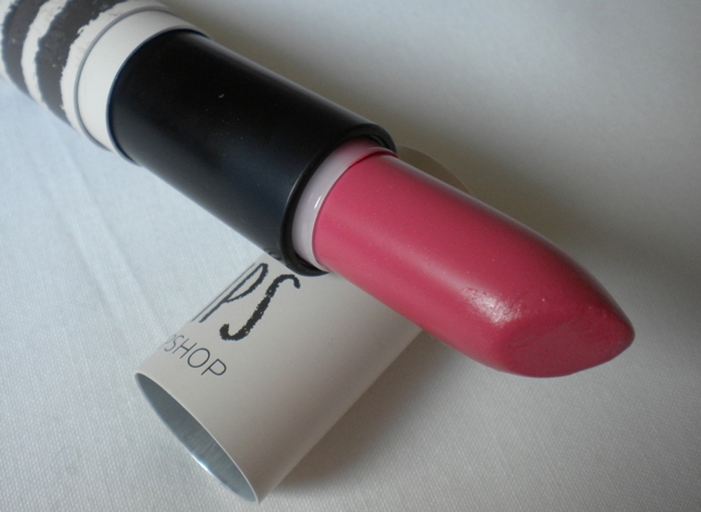
Topshop 'Show Off'

4. What is your favourite lipstick brand?
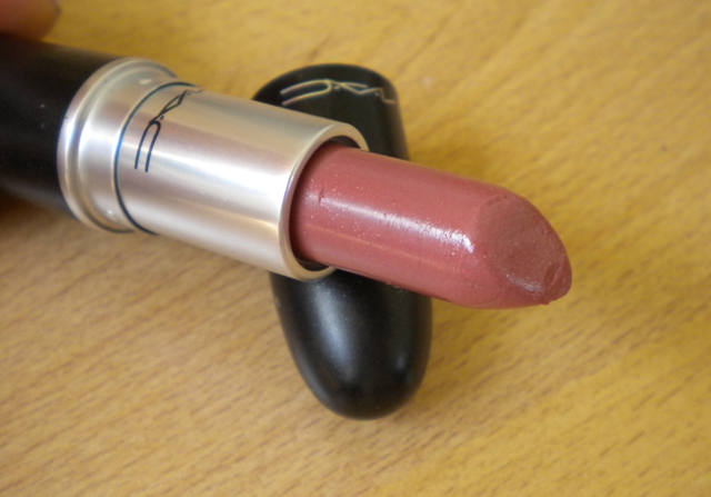
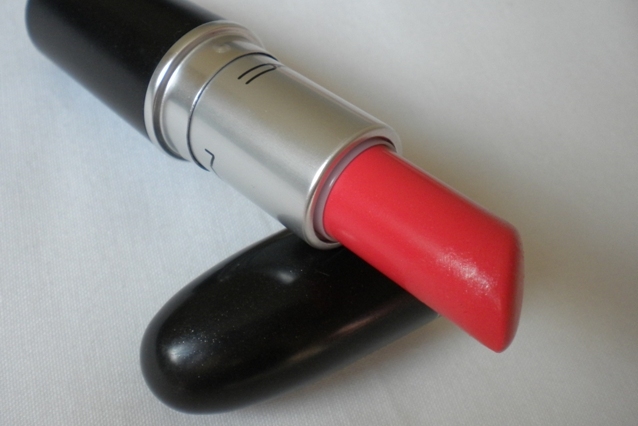
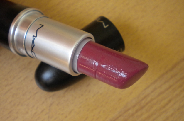
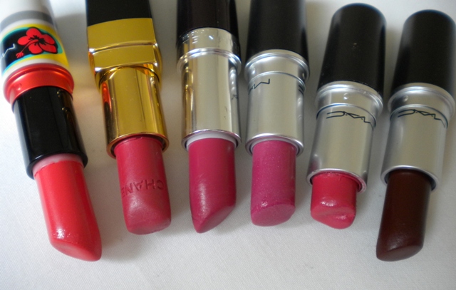
I like MAC for their huge variety of colours and finishes. Another favourite is Chanel since I don't think their lipsticks can be beaten in terms of texture.
5. Favourite Pink?
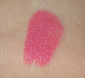
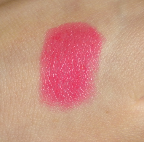
I don't wear true pink lipsticks too much. I recently picked up Topshop 'Show Off' lipstick though and I've been liking it a lot so I think that has to be my new favourite pink.


6. Favourite Nude?
I don't actually wear nude lipstick much anymore but I used to wear MAC Patisserie a lot which is a great natural shade. I tend to use this a lot on other people too.


7. Favourite Peach/Coral?
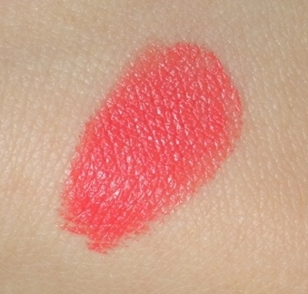
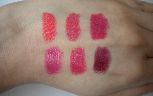
It has to be MAC Vegas Volt which is a fantastic bright coral. This looks great when it's sheered out a bit too so that becomes a slightly softer coral shade.


8. Favourite Red?
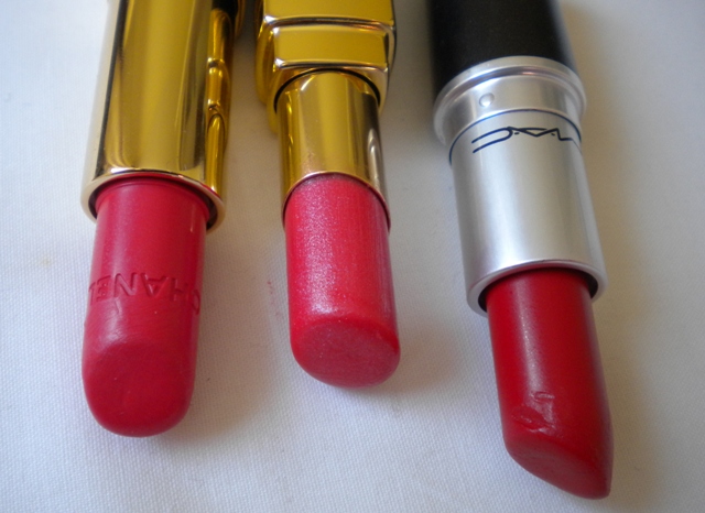
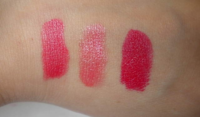
Well since red is my favourite lipstick colour I couldn't pick just one! So the three that I love are: Chanel Rouge Allure in Flamboyante, Chanel Rouge Coco Shine in Monte Carlo and MAC 'MAC Red'.


9. Favourite Hot Pink?
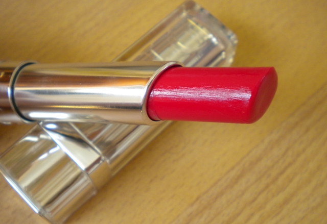
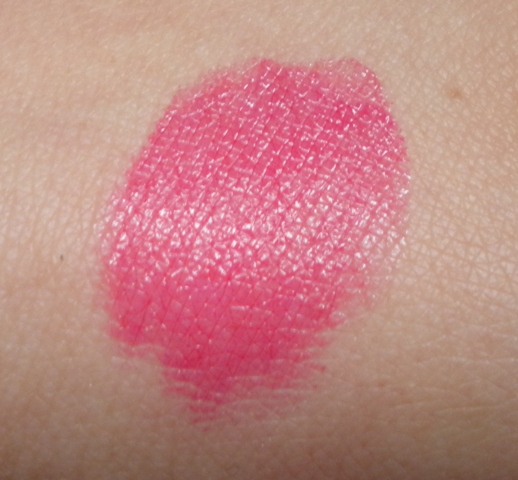
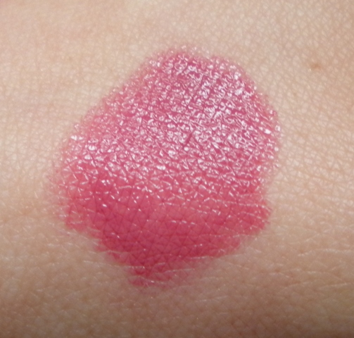
Dior Addict Lipstick in Collection. It looks red in the tube but it goes on as a hot pink.


10. Favourite Brown?
Hmmm.....we've moved on from the 90's I think! :D

11. Favourite Rosewood?
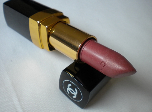
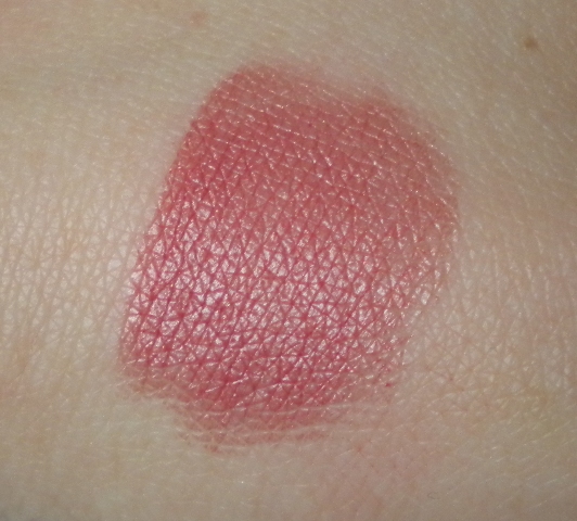
Chanel Rouge Coco in Organdi Rose. This is a lovely rosey shade which is great for a very natural look. My photos don't do it much justice I'm afraid!


12. Favourite Plum?
MAC Plumful. I like this one in winter especially.


13. Other Favourite Lipsticks?
MAC Hibiscus (limited edition), Chanel Rouge Coco in Orchidee, Rimmel Lasting Finish Lipstick in Heartbreaker, MAC Milan Mode, MAC Lustering and MAC Media (not one I'd wear on myself too much but I really love dark vampy lipstick shades and this one is beautiful for those that can pull it off!).


14. Favourite Lipglosses?
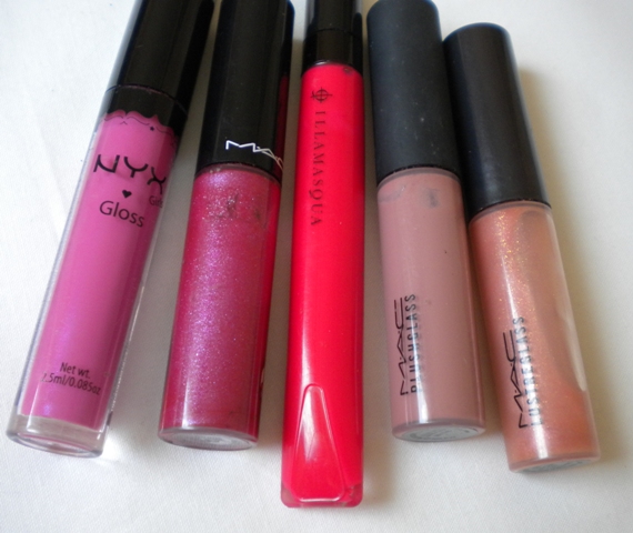
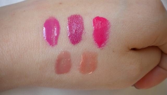
NYX Round Lipgloss in Doll Pink, MAC Lipglass in Hot House (limited edition), Illamasqua Intense Lipgloss in Petulant, MAC Ample Pink Plushglass and MAC Love Nectar Lustreglass (looks lovely over coral lipsticks).


I wasn't tagged by anyone - I just thought I would do it anyway. I tag anyone who would like to do this!


Illamasqua Powder Blush Swatches Part 2 of 2

After the last post's tame blush colours, today's swatch post on the Illamasqua Powder Blushes (or Blushers if you aren't in the USA) are a much wilder bunch. Unlike last posts's mainly pink-based selection of pastels and some muted brights, today's range of colours goes all out to please the wildest imagination, while still remaining wearable. My favourite colours from the Illamasquaa Powder Blush/Blusher range all come from today's set of swatches too!

Illamasqua Powder Blushes

L - R: Excite, Kiss, Sin, Beg, Create

Excite is a bright neon orange, very in-your-face. It looks kinda like an orange crayon.

Kiss is a plummy-pinky-brown. Now I know it looks really blah in the pan, but this happens to be a a colour I actually own, and it's my favourite Illamsqua Blusher colour. It look very brown because when I swatch it I layer it on, but with a light hand it's a pinky-brown colour with a hint of plum.

Sin is a bright plummy pink, heavy on the plum. Unlike Kiss, this one looks pretty much the same on your cheeks as it does on your arm. It's like NARS Mata Hari, but on steroids. For those who felt NARS Matat Hari didn't cut it, this one is brighter and more intense in colour.

Beg is perhaps my second favourite colour in the entire line (another shade I actually have). It's a pinky-brown colour like Kiss, but less plummy and thus more warm-toned. It's also a bit brighter in shade, and very well pigmented.

Create is the weirdest blush colour I've ever come across. It looks like the stuff you'd find in the squat toilets I mentioned in this post. Anyway, Create is a yellowy-brown, very heavy on the yellow. I'm guessing this would be a contouring colour of some sort for very warm-toned girls.

The Illamasqua Powder Blushers are quite impressive in terms of texture and pigmentation, which is why they have such a huge following. I've previously done an FOTD with Illamasqua Sin and an FOTD with Illamasqua Beg, and I didn't come out looking like a clown (or at least I don't think so anyway), so these colours are perfectly wearable with proper application.

Saturday, June 25, 2011

Illamasqua Powder Blush Swatches Part 1 of 2

Ooh, Illamasqua - the UK's answer to MAC, has garnered a huge following for their image of being as out-there and as daring as MAC - in fact, perhaps more so, due to the visionary leadership of Alex Box. They've definitely had the support of the blogging community in their early days, although there has been a lot of talk about the brand "selling out" to mainstream media now that they've ridden to success on the support of the blogosphere, and aren't engaging the bloggers who supported them anymore.

With that kind of image and background, it's almost kind of disappointing to find out that a lot of their Powder Blush colours are so tame. In fact, for today's first half of the swatches, almost all of these are really wearable and - dare I say? - some even ho-hum. That said, you can't fault the quality of the blushes - I have three of their blushes (none of the ones pictured here, unfortunately), and I love them all. They're well-pigmented, nicely-textured, and stay on for a decent length of time. What's not to like?

Illamasqua Powder Blusher Swatches

L-R: Katie, Nymph, Tremble, Chased, Hussy

Katie is one of the best selling colours in the Illamasqua line, and one of the more popular ones, but honestly, this is a little boring to me. Yeah, yeah, pale pastel pink. Looks good on most girls. Doesn't every brand have one of these?

Nymph is similar to Katie, but less pastel and a bit brighter, and maybe a hair darker. It's a good alternative to Katie for darker girls who might find that Katie could look ashy on them.

Tremble is a light coral-peach. This colour is pretty unique. Most coral blushes I've seen tend to be quite bright, so this is probably one of the few pale coral blushes out there.

Chased is similar to Nymph and Katie, but is the darkest and brightest of the lot. It also leans more purple than either Nymph or Katie. I like this the best in the lot.

Hussy is also another pretty, intriguing colour that would probably still be wearable with a light hand. This is a coral with a hint of hot pink - very pretty indeed. Me likey.

For some reason, almost all the Illamasqua blushes are matte. I think the formulation of this is deliberate - the theory is probably that if you want to add shimmer to them, you will layer on a separate shimmer product to customize the level, size, and type of shimmer/glitter you want - just like the pros. These are all work-appropriate since they are matte, and come in wearable colours. Despite the brand's outrageous image, today's swatches are all colours you can wear to the strictest office.

Monday, June 20, 2011

Majolica Majorca Jeweling Pencil Eyeliner Swatches

Majolica Majorca is the offshoot of Shiseido, the Japanese brand famous for skincare, as well as makeup. Majolica Majorca is very popular among Asian girls, with its "Shiseido-for-a-cheaper-price" appeal. That said, I have to admit, Majolica Majorca is one of the better Asian drugstore brands I've seen to date, with their quality of products.

Majolica Majorca has a line of pencil eyeliners, called the Jeweling Pencil Eyeliners. Why they're called Jeweling is a mystery to me, but I guess it's a reference to the sparkles in the pencil eyeliners, since it's definitely not the colours.

Majolica Majorca Jeweling Pencil Eyeliners

L - R: BK999, BK901, BL503, PK204, BR606, Marble 71, Green Jewel GR522, Amber Flakes BR633

BK999 is a soft matte black.
BK901 is a black with sparse silver glitter.
BL503 is a deep colbalt blue with sparse silver glitter.
PK204 is a frosty pale pink. Pink eye anyone? LOL. This would probably be good on the waterline.
BR606 is a warm yellow brown with sparse gold shimmer.
Marble 71 is a frosty gold that isn't that greatly pigmented.
Green Jewel GR522 is a light grass green with gold shimmer. The shimer in GR522 is a bit denser than in the other colours.
Amber Flakes BR633 is a deep brown, less warm than BR606, with gold shimmer. I'm not sure if I'd call it amber flakes, but it's pretty. Again, the glitter in this is denser than the other shades.

I don't know why some of the shades have shade names and some don't, but I guess the ones with the names were part of a later release. These went on with a nice glide, and were decent in pigmentation, althought they didn't stay that long.

Saturday, June 4, 2011

Kanebo KATE Lipgloss S Swatches

KATE is the drugstore arm of Kanebo cosmetics, the ever-popular Japan-based cosmetics and skincare brand. KATE has been gaining popularity among Asian girls as it is often perceived as being similar to Kanebo, it's more expensive sister, but at a better price point. That, combined with the cutesey marketing and the "it's-from-Japan" hype, has garnered it something of a small following.

One of KATE's latest products is the Lipgloss S, consisting of just five colours. I have to admit, Asian cosmetics naming conventions are so odd that although I'm Asian myself, I've no idea what S stands for. Shine? Shimmer? Sheer? Sticky? Well, the Lipgloss S is all of those, so I guess they picked the letter quite rightly. Anyway, enough of my snark, here are the Lipgloss S swatches.

Kanebo Kate Lipgloss S swatches

L - R: PK-2, BE-1, PK-1, BR-1, RD-1

In general, Asian cosmetics naming conventions for lip shades go as such:
PK = Pink
BE = Beige
BR = Brown (although oftentimes in Asian cosmetics "brown" really looks more like "pinky-brown-that's-not-pastel")
RD = Red
PP = Purple (once again, not as purple as it sounds, it's usually used for plummy shades)

And the 1, 2, 3 etc numbers usually denote depth or darkness of colour. So, say PK-1 and PK-2 would be both pinks, but PK-2 could be reasonably be expected to be darker than PK-1. Which in itself isn't saying much, because you know, darker could be one shade darker, or three shades darker, and there is huge variance in shade depth between shades.

Anyway, here's my colour description below:

PK-2 is a pale, purply-pink with big chunk of glitter.
BE-1 is a pale, sheer, peach with glitter.
PK-1 is a pale, pastel pink, that's not as purply as PK-2, and also has glitter.
BR-1 isn't as brown as the colour naming scheme makes it sound. It's actually a gorgeous neutral pinky-brown, a lovely MLBB (My Lips But Better) shade.
RD-1 is the lone shimmer-free shade in the range. It's a sheer red, perfect for girls who want an introduction to the red lip.

As I've mentioned previously, all these glosses are sheer, have copious amounts of shimmer, and are really, really sticky. Like, Lancome Juicy Tubes kind of sticky (and if you're a makeup fanatic like me, you'll know the Juicy Tubes are famed for being possibly one of the stickiest glosses ever to have touched the lips of womankind). As it tends to be with Asian cosmetics, the lighter shades tend to be sheerer and have more shimmer, while the darker shades tend to have better pigmentation and be less glitterbomb-ish.

Wednesday, May 25, 2011

26 Colour Eyeshadow and Blush Palette: Swatches

One of the items that has been gaining popularity in recent years has been makeup palettes containing large number of colours, like the 88 colour eyeshadow palettes that have been popular in various forms. The reason why these are so popular is that they are cheap, and have a large variety of colours. I couldn't help but end up with one myself - the ES 26 Colour Eyeshadow and Blush Palette, from this page on the KKCenterHK site.

As you may know, KKCenterHK has been gaining popularity with some makeup fanatics for its wide array of cheap and cheerful makeup items. The 26 Colour Palette cost US$15, which works out to less than a buck per colour. Not bad at all, price-wise. But I was curious as to the quality of the palette, so I thought I'd provide some swatches for a start.

ES 26 Color Eyeshadow Blush Palette

The palette itself comes in a plastic case, that, while not luxe-looking, certainly doesn't seem cheap and flimsy. The palette is also of quite a substantial size - sometimes, with these palettes with humongous numbers of colours, each individual colour can be the size of a dime or something like that. But each individual eyeshadow pan size is only slightly smaller than that of a MAC eyeshadow, which is pretty decent. Here's a photo for comparison. The MAC eyeshadow, Dazzlelight, is placed in between two eyeshadows on the palette. The two larger pans below it are blush colours.

26 colour palette size comparison


Altogether, there are 21 eyeshadow colours, and 5 blush colours, making that 26. As you can see from the photo below, the colours are mainly warm neutrals, with some bright "sunset" colours (e.g. rust orange, gold) thrown in. Some of the blush colours look a little similar to eyeshadow colours, and a few of the eyeshadow colours are quite close to each other. Generally, though, I'd say the palette colour range is quite decent if you like these types of colours.

es 26 color eyeshadow blush palette (2)


Here are swatches of the palette, row by row. The first row is below:

es 26 color palette row 1 swatch


Row 1, L-R: bright orange with shimmer, light tangerine orange with shimmer, warm brown with slight shimmer, matte light pink, bronzey brown with shimmer, brown with a tinge of red with shimmer (think along the lines of Stila's Barefoot Contessa), medium brown with shimmer, which I really like - it could almost be a taupe!

es 26 color palette row 2 swatch


Row 2, L-R: pinky-peach with shimmer (sort of like NARS Orgasm blush in eyeshadow form), burnt orange brown with shimmer, muted neutral brown with no shimmer, rust-red-brown with shimmer (it isn't as red as it looks in the photo, but it is quite rusty in colour), medium warm matte brown, deep matte brown, shimmery brown-gold.

es 26 color palette row 3 swatch


Row 3: Warm orange-pink, shimmery burnt-orange brown, muted matte brown, deep purple with the slightest hint of shimmer, muted neutral brown, slightly darker and less warm-leaning than the previous brown in this row, midtone purple-magenta, and a gorgeous taupey brown shimmer, my favourite eyeshadow colour in the entire palette.

Lastly, here are the blushes.

es 26 color palette row 4 swatch


Row 4: Light peach, pale baby pink-beige, medium pink, deep purple (sort of like the second-last purple in Row 3 of the eyeshadow range), and russet red-brown (similar to the middle colour in Row 2 of the eyeshadows).

Pigmentation and texture of the eyeshadows was actually very decent. In general I didn't have too many problems with pigmentation, and texture was pretty decent. As with some of these palettes, the shimmer colours for some reason were of better quality than the mattes, being softer in texture and better in pigmentation Still, the palette in general was of better quality than expected.

Over the next few days, I'll be showcasing a few EOTDs (Eye of the Days) using this palette, and we'll see what looks I can come up with! In the meantime, if you're looking for a palette of decent quality at a cheap price, and if you like warm colours and neutrals, this palette would definitely be worth checking out.

(Product was sent for review. Review is my complete and honest opinion. I am not affiliated with/compensated by the company.)

Thursday, May 19, 2011

Dior Addict Lipstick 865 Collection Review


Dior have just recently revamped and modernised their iconic lipstick, Dior Addict. It now has an entirely new appearance and formula and the collection contains an incredible 44 shades! Dior have categorized the lipsticks into three different styles which I think is really fun. The three styles are: Rock Icon Style, Doll Style and Glam Icon Style.

The shade that I bought is 865 'Collection' and belongs to the Glam Icon Style! It looks quite red in the tube but when applied it's actually a gorgeous fuchsia/bright pink colour. I think this is the kind of shade that could absolutely be worn either with a stronger look for nighttime or to add some colour to a more neutral daytime look.


The new formula has less wax than a classic lipstick. Instead it has a gel which claims to provide hydration and shine. I think this just may be one of the best textures in a lipstick that I've tried so far. It's smooth, has a gorgeous shine and is comfortable to wear. It also has a lovely amount of pigment - not as much as the Dior Rouge lipsticks but still a fantastic amount. On top of all that I think the packaging is just so beautiful! The price is very steep though at €28. I was lucky enough to have a gift card which I bought this with but I still think if you want a bit of indulgence then they are worth splurging on. The only fault I can think of is that these have a rounded top instead of the classic pointed one which makes them a bit harder to apply precisely so therefore I find that a lip brush is required. 

Compared to my Chanel Rouge Coco Shine this has more pigment. The Chanel, however, is a bit glossier. The Chanel Rouge Coco Shine also feels more moisturising but I think the Dior Addict may be a bit more long-wearing. It's really hard to pick a favourite! For ease of application and less effort I tend to grab my Coco Shine. However, when considering shade range and quality of colours then the Dior Addict comes out on top.

Pros: Smooth, hydrating, nice shiny finish, good pigment, amazing packaging
Cons: Price, rounded shape makes application more difficult

Mark out of 10: 9

Would I buy again: Yes


Hope everyone has a lovely weekend whatever you get up to! I'm off on a little holiday to Rome tomorrow for a few days which I'm extremely excited about! (: