Sunday, May 30, 2010

Summer Bronzing: Barry M Natural Dazzle Bronzer Swatch

It's summer, so I'll be attempting to swatch more summer items, like bronzers! Now personally I'm not a fan of bronzers, as being Asian I've spent my entire life being indoctrinated with the kooky belief that fairer=good, and as a result I always want to be that shade of pale that's always out of my range. LOL! Nevertheless, I can certainly appreciate a beautiful tan on another girl. And why not? A tan is so summery, and it makes a lot of the seasonal colours so in vogue now pop a little more. So while I'm intent on sloughing on all the sunscreen I can lay my hands on, for everyone else who is more normal (LOL!) I'm swatching a couple of bronzing items for you guys!

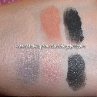
Today we start off with a cheap but good one - good ol' Barry M. Barry M strangely only has one (yes, one) shade of bronzer, and this is called Natural Dazzle. So that makes the Barry M Bronzing line easy to swatch, hah! Anyway, given that this has to be a one-size-fits-all shade, I think they've done a pretty good job. The bronzer in question is a nice shade of medium neutral brown, although there still is a teensy hint of orange that might make it not too great on very pale girls with cool undertones. It also has some shimmer, but not enough to be horribly distracting or OTT. I think it's a good amount, and the shimmer is fine enough to not be too obvious.

Here is the swatch:

Barry M Natural Dazzle

As you can see, the name "Natural Dazzle" is a bit of a misnomer, because the shimmer isn't THAT dazzly. But tht's what makes it good, in my opinion. I think the level of shimmer is just nice. This would make a good bronzer, although I doubt anyone would want to contour with it (the Sleek contour palettes are probably better for that), because in general contour shades used to shadow your face (the ones that are darker than your skintone) should ideally be devoid of shimmer. But for light and medium girls with neutral-to-warm undertones, this would probably work well as a bronzer.

Saturday, May 29, 2010

DAILY CARE FOR DRY SKIN


Sorry readers, sorry to keep you all waiting. Actually I was not well so couldn’t write anything. Anyways today I’m gonna tell you in great detail about the care of dry skin.

   This type of skin besides giving you a rosy look on the cheeks also absorbs all the moisture provided to it leaving a taut dry look to your skin.

                                    IDENTIFYING DRY SKIN

1.   The skin has few flaky patches that disappear with rich moistening creams.

  1. It looks fine textured i.e. the pores are not visible.
  2. You will have tiny expression lines around your eyes.
  3. The skin of the neck and cheeks seem creepy.

REASONS FOR SUCH A SKIN

The human skin breathes oxygen for which its pores should be absolutely clean. There is also a very high content of moisture in the skin cells which gradually decreases with age or vitamin deficiency. The moisture glands of the skin get more ineffective, resulting in a dry, wrinkled skin.

                                    CARE REGARDING THIS SKIN TYPE

              I.      Good healthy diet

           II.      Lots of fresh fruits and vegetables.

         III.      8 hour sleep.

        IV.      Exercise.

           V.      A daily beauty routine.

These were some of the basic cares.

            Firstly you should cleanse properly. An effective cleanser will remove all pore blocking substances without leaving the skin dry or stripped off pf its natural protective mantle. The cleanser must be massaged gently paying particular attention to the skin of the nose, chin and ear lobes. Always use moist cotton wool to prevent moisture absorption from the skin. A cactus cleanser with a lemon base is best as the cactus has the highest moisture retention capacities. The lemon is a natural cleanser as well as natural bleach. It makes the skin look fairer after some weeks if this cleanser is applied daily in the morning and evening (bedtime).

            Second step should be toning which is an essential follower after the cleansing process. Toning removes dirt and stimulates skin circulation. A skin tonic is advisable.

     In my next post I will tell you about the use of tonic and other steps regarding the care of dry skin.

Friday, May 28, 2010

Giveaway: Win a SkinCareRX $100 Voucher!


If the title of this post didn't excite you, I don't know what will :P Basically, SkincareRX.com is giving away a $100 voucher! And it's open internationally! SkincareRX.com is an online store that carries a whole lot of awesome brands of cosmetics and skincare, in particular the La Roche-Posay Anthelios line. I don't know about you, but it's really popular in Europe and Asia. In Asia particularly there's a lot of buzz about their sunscreens. When I had to see a derm in Singapore to get a sunscreen for my photo-sensitive skin, La Roche-Posay Anthelios was one of the lines he recommended.

Anyway, enough with my chatter. On to the giveaway!

Rules:

1. Must be a follower of this blog.

2. Fill out the form below. Please DON'T comment on this post!

Entries:

You must do one or more of the following for the number of entries specified:

1. One Entry: Becoming a fan of SkincareRX on Facebook

2. One Entry: Following @skincarerx1 on Twitter. If you also follow @musicalhouses on Twitter, you get an extra entry.

3. Two Entries: Tweeting about the giveaway. Include @skincarerx1 and @musicalhouses in your tweet, as well as a link to this post.
Feel free to use this text: 2 entries if you tweet about the giveaway linking to this post. Include @musicalhouses and @skincarerx1 in your tweet. Feel free to use this text: "Giveaway: Win a $100 @skincarerx1 Voucher by entering on @musicalhouses blog! Link: http://goo.gl/fb/OLSB2"

4. Five Entries: Signing up for the SkinCareRx Newsletter (found at the bottom of the SkinCareRx.com's website)

5. Ten Entries: A blog post of minimum 100 words, with the text-link "La Roche-Posay Anthelios" linking to the SkinCareRX La Roche-Posay page.


(Note: Form is embedded above. If form isn't working on this page, it should be accessible HERE.)

Thursday, May 27, 2010

Are They Dupes? GOSH Bourgogne vs MAC Sweetie Lipsticks

In my last post swatching the GOSH lipsticks HERE, I mentioned that GOSH Bourgogne 66 was a more punched-up, pigmented version of MAC Sweetie. I thought they were similar because they were both plummy pinks with shimmer, so here are actual lip swatches for comparison!

Now that I actually swatched both of them side-by-side, I realized that while they might both be in the same plummy-pink-with-shimmer category, in terms of intensity these are two very different creatures. GOSH Bourgogne is a helluva lot more pigmented and intense than MAC Sweetie, so if you're looking for a pigmented lipstick, the GOSH is the obvious winner.

Here's a swatch of my bare lips for comparison:


Here's a swatch of MAC Sweetie. I love this lipstick:

MAC Sweetie Lipstick Swatch

I really like MAC Sweetie, it's a very work-appropriate colour, and it's a very sweet-looking pinky-plum with silver shimmer, and it's a slightly cool-toned colour. It's shimmery without being frosty, and it's not too sheer although it isn't totally opaque. This is one of the no-brainer shades I like to use when I can't think of anything else.

Here's a swatch of GOSH Bourgogne:

GOSH Bourgogne Lipstick Swatch

GOSH Bourgogne is like MAC Sweetie, but really revved up. It's also a slightly cool-toned pinky-plum, but really pigmeneted, to the point where it's a very bright colour. It also has a blue flash duochrome going on, which makes it really cool. I don't know if you can see the blue flash on the lips, but it's more obvious in the tube. The blue duochrome is more diminished once applied on the lips, so the net effect is shimmer that just ever-so-slightly flashes blue. It's not noticeable once it's on the lips, but if you look at the lipstick in the tube, its a lot more obvious.

Formula-wise, I found the two lipsticks to be similar. On me, both of them were a little on the slightly dry side, although the GOSH was slightly more dry than the MAC. I'm one of those weird people who find all MAC lipsticks drying (even the Lustres and Cremesheens), but if you aren't one of those, then you might find the MAC substiantially less drying.

So between the two, which one should you pick? Once again, it depends on a number of factors. If you love bright, pigmented lipsticks, then GOSH Bourgogne is definitely the one to pick. But if you want something less flashy and more work appropriate, or if you want a lipstick that's more sheer, then MAC Sweetie is a better choice for you. And if you want the less drying of the two, then MAC Sweetie is probably your best bet.

Tuesday, May 25, 2010

NOTD: Nails Inc Diet Coke Paris: A Lovely Berry Creme

I'm sure you already know this, but for this month, whenever you buy 2 500ml bottles of Diet Coke, you get one bottle of Nails Inc polish free, out of a choice of four colours. The colours are all named after fashionable places - London, Paris, New York, and Milan. In one of my previous posts I featured Nails Inc London, with some comparison swatches HERE, and this post I'm featuring another colour - Nails Inc Paris!

Despite being a freebie, Nails Inc Paris, as with Nails Inc London, applied beautifully, was well pigmented, and totally opaque in 2 coats. It has a lovely creme finish, as does Nails Inc London. But while Nails Inc London is a greige-y nude, Nails Inc Paris is a bright but still muted berry-toned plum creme. I really love this colour, it's perfectly in between plum and purple. It looks really delicious, it reminds me of berries and jam. Yum. Berries.

Ooh, stubby fingers:

Nails Inc Paris

And here's a picture with the bottle. I know it's blatant product advertising, but I actually think the Diet Coke logo on the bottle is kinda cute:

Nails Inc Paris Diet Coke

This is actually similar to Nails Inc Piccadilly Circus (which I used in a very unfortunate and ugly KOTD HERE). Both of them are cremes and of similar colour and depth, but I think Paris is a lot more purple than Piccadilly Circus, which is a more straightforward berry pink.

Monday, May 24, 2010

ORLY Nail Polish in Lollipop - Swatch

I'm loving this ORLY Nail polish in Lollipop.  It's one of my new favs.  It's a purple pink shade - soft and sutle.

The camera washed out the color a little bit.  ;(


Gold & Bronze Cut Crease using Wet N Wild ColorIcon Palette in Vanity

Hey Lovelys,
This is a look I did using the Wet N Wild ColorIcon Palette in Vanity. 


What have I been up to?

Hi everyone =)


I haven't really been blogging regularly, but i do have a valid excuse... I've been busy revising for exams (nearly there!) and just been working really hard.


So here are some pics of my latest craze; daisies!!


This is a Daisy Chain bracelet i made last night while taking a break from revision, as you can tell from the amount of pictures i've taken of it i'm pretty proud of it! I hand-made each individual daisy, it was quite difficult because they're so small! I admit that it's not perfect, but when i have time i'm sure i'll come up with a way to make the daisies better. I've also attached a clear swarovski heart crystal to the end, it's so cute!
I also made a pair of pink daisy earrings to go with the bracelet. The picture isn't great, my apologies!


Anyways, this is just a short update, and i hope everyone is well! Thank you for stopping by! Stay beautiful my lovelies! Lots of love <3 xX

My First Ever Nail Swatches!

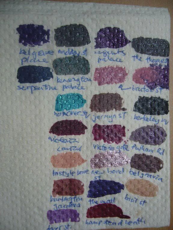
Today is nostalgia day! These are my first ever nail polish swatches - and as you can see they're the lousiest possible swatches anyone could make. They're made on a paper towel, and these were a bunch of swatches made at the Nails Inc store, and I made them on a piece of tissue paper because that was all I had to swatch on, and I couldn't do it on my own nails because they were painted with something else at that point in time. LOL!

Nails Inc Swatches

Here are the names by rows:

1st: Belgrave Place, Maddox St, Regents Palace, The Thames
2nd: The Serpentine, Kensington Palace, Bruton Street
3rd: Hanover Square, Jermyn Street, Berkeley Square
4th: Victoria Caviar, Victoria Gate, 80 Fulham Road
5th: Instyle Bare, New Bond Street, Belgravia
6th: Burlington Gardens, The Mall, Basil Street
7th: Dover Street, Hampstead Heath

I can't believe I started out making swatches like these, because they really are quite craptastic! I just posted them here for a laugh more than anything else, so I hope they've entertained you!

Saturday, May 22, 2010

some other skin types


Today I’m gonna tell you about some more types of skin & the care of your skin. Apart from the major skin types of skin there are other skin types also like SENSITIVE SKIN (react to changes and show a reddish look or itch), HYDRATED SKIN (to much moist and look puffy and congested) and AGEING SKINS (time tired skin).

            The first and the foremost step to take care of your skin is to identify it.

These are some basic points that will surely help you in your task:

  1. Cleanse your skin twice a day with the products suitable to your skin type.
  2. Avoid the sun and smoking.
  3. Drink 8-10 glasses of water everyday.
  4. See a beauty therapist at least once in every 4-6 months after the age of twenty five.
  5. Exercise regularly & use a face mask once in every week.
  6. Neglect accelerates ageing more than anything else.

In my next post I will tell you in detail about the care of different skin types.

Till then adieu and be happy.

Eyeshadow Tutorial for Asian Eye Shapes: Round Prominent Hooded Eye

Today, we are continuing what I started some weeks back in this post HERE: my series on eyeshadow tutorials for Asian eye shapes! In this series of tutorials, we look at different Asian eye shapes, and suggest eyeshadow placement for that particular eye shape.

I know there are currently tons of eyeshadow tutorials for Asian eyes, but the problem with those is that they often assume that there is only one generic Asian eye shape. However, Asian eyes come in various shapes and sizes too, just like Caucasian eyes, so to give a generic "eyeshadow tutorial for Asian eyes" is a bit misleading, as it implies all Asians have the same eye size and shape. Thus, any generic Asian eyeshadow tutorial is bound to help some girls, but not others. What we need is a series of eyeshadows geared to different types of Asian shapes, instead of just one generic tutorial. (For more information, check out the first half of THIS POST - it has more information on the misconception that all Asians have the same eye shape.)

Thus, in this series of posts, I look at a different type of Asian eye each time, and suggest eyeshadow placement for that specific eye shape. Hopefully this will help some girls out there!

Today, we are looking at Blair's eye. I really need to apologize for the pictures, they aren't great but they were the best I could get. As you can see, Blair's eye is very different from Wendy's eye (which we looked at last time HERE). Here are the main features of Blair's eye:

Asian eyeshadow tutorial

1. Blair's eyes are actually very round (by Asian standards, anyway). She also has pretty large eyes. I know you can't see this because it's not a full-face shot, but her eyes are her most prominent feature because they're big and lovely.
2. Her eyes are very prominent - you can see the entire eyeball's outline in the eye socket (this is particularly obvious if you compare it with Wendy's eye).
3. Like Wendy in the previous post, she also has hooded eyes.

I know most people would think that having prominent eyes and hooded eyes sounds like a contradiction, because they are thinking about the typical Caucasian prominent eye, which rarely comes with a hooded lid. However as you can see in the above photos, although her eyeball is pretty prominent, she also has a hooded eyelid, because when she opens her eyes, you can see that half of her lid space is covered by the crease area, and the crease kind of folds over onto her lid.

Another thing I'd like to point out is that although Blair's eyes are prominent and large, they don't resemble the typical Caucasian prominent eye shape. This is why it is difficult to transpose techniques for prominent Caucasian eyes onto Blair's eyes, although both eye shapes can be classified as "prominent". Blair's eyes are prominent - as you can see the eyeball kind of "sticks out" and is not sunk into the eye socket, and if you looked at a full-face photo of her (unfortunately this isn't available), this would be very obvious because her large eyes are her dominant facial feature. However unlike prominent Caucasian eyes, which in general tend to be really contoured and defined, Blair's eyes don't have the sharp, defined contours often associated with prominent Caucasian eyes, although they are the dominant feature of her face. Thus, because the Asian prominent eye is sometimes slightly different from the typical Caucasian prominent eye contour-wise, it requires different treatment when it comes to eyeshadow placement.

So how should we treat Blair's eye?

First, as always, we put on a highlight and lid colour. For Blair, because her eyelid is hooded, although she has a crease line, it doesn't coincide with her actual contour area of the lid. This is actually really common in Asian eyes, and is also seen in Wendy's eye.

Thus, for Blair's eye, as with Wendy's eye, we place the base shade all the way up to the eyebrows, and the lid shade stops not at the crease, but above it.

Here's an eye diagram showing the placement of base and highlight shades on Blair's eye:

Asian eyeshadow tutorial

Because Blair's eyes are relatively large in size, and her eye is prominent, she can actually get away with dark lid colours. In fact, they help to recede her eyelid area a little, making it less prominent and more contoured. However I didn't use a dark colour for this tutorial, because Blair wasn't very into dark eyeshadow. So this is the result:

Asian eyeshadow tutorial

We now look at the placement of the crease shade for Blair. Once again, as previously emphasized, when applying the crease shade, we would like to place the crease not in the crease line of Blair's eye, but further up, in the contour area, where her eyeball meets the eye socket. This enhances Blair's eyes. If we had placed the crease colour right in the crease line, we would be applying the crease colour somewhere in the middle of her eyelid, and this would just make her eyes look really odd.

Here's what I wrote in my previous post in this series, on the issue of crease line vs contour area in Asian eyes. I'm repeating it here, because I think it applies to this eye shape, too. (for the full text, see the previous post in this series):

What we are trying to acheive with the lid and crease colour is to contour the eye. In most Caucasian eyes, the crease happens to meet with the contour of the eye, which is where the soft eyeball ends and where the socket bone begins. Thus, when you look at a typical eyeshadow tutorial that assumes a Caucasian eye shape, they often tell you to put a dark colour in your crease, and if you had such an eye shape, that would be correct, because your crease would coincide with your contour. The only exception to this is Caucasians who have hooded eyelids. However, in Asians, often our crease isn't where our contour is. Here you can see that the actual contour of the eye, where the eyeball meets the eye socket, is much further up than the crease, which happens to be somewhere in the middle of the lid. This is like a hooded eye, but not quite the same thing. In Caucasians it often happens due to aging, where the eyelid just tends to droop down with age, and when this happens, there is a lot of skin where the fold is. In Asians, it's just our genetics, so we don't really have as much skin in the fold, but we do get a similar end result which causes our crease line to lie below our eye contour area.


Thus, when applying Blair's crease colour, we apply the crease colour in the contour area, not in the actual crease line:


So on Blair, this is what it looks like. I do admit the blending could be better, but this is just a rough guide to placement:


This is more or less the basic for Blair's eye - base, lid, and crease. However, because Blair's eye is prominent and round, we can add a little more definition to it by adding a darker colour in the outer V area.

Here is a diagram of where the outer V colour can be placed:


This is how the outer V shade would look on Blair's eye. Once again I think the blending could be better, but as with the previous picture, this is just a rough guide so you can see the placement of eyeshadow:


The key when doing an eye like Blair's is to remember that her eye is prominent, and is quite round, and in some Asians (as is the case for Blair this time), runs the danger of potentially looking contour-less if eyeshadow is applied badly. Thus, we use the shading of the contour/crease colour and the darker colour of the outer V to give her eye a little bit more contour and dimension. We should also be careful to apply the crease colour in the actual contour of the eye socket area, instead of the fold of lid that lies in the middle of her eyelid, in order to enhance the contour the eye. I didn't really use a highlight colour here, because my main focus today was the placement of crease colour and the outer V, but a good highlight colour would also help.

And that's it for today! I hope this post helps someone!

Friday, May 21, 2010

Lusting After: Barry M Mushroom Nail Paint - Where Is It?!

Okay, Barry M, hand it over. I KNOW you have it. I KNOW you've released this fabulous new shade of nail polish called Mushroom, and we both know it's right up my alley, since it's another one of those brown-grey mushroom shades I love so much. And you know I'll buy it. In fact, you know I'll probably buy TWO, because right now Superdrug is having a 2 for 5GBP promotion on Barry M Nail Paints.

So WHY can't I find it any of my Superdrugs?! I've been to 2 or 3, and I've seen all the other new colours - Strawberry Ice Cream, Berry Ice Cream, Blueberry Ice Cream, and Lemon Ice Cream - and I think they're alright, but where's Mushroom? That's the one I really want!

And don't tell me you don't have it, Barry M. I know you do. Your website HERE has a really tantalizing, teasing picture of Mushroom. I want I want I want. Maybe it's not quite the epitome of a mushroom griege shade, because from the picture and from swatches I've seen, it's a little too heavy on the brown and doesn't have as much purple as I'd like, but I want it anyway. I mean, it's a greige, right?

One day I'll get my hands on it. In the meantime, Barry M, can you please replace the picture of the model on your website HERE. Seriously, something's a little unsettling about that picture - is it because the girl is too skinny, too skinny, or too skinny? I seriously hope no young impressionable minds get body image issues looking at that photo. (Okay, I know there's more to body image issues than looking at photos of stick-thin girls, but you gotta admit this ain't helping.)

Wednesday, May 19, 2010

GOSH Lipsticks Swatches: Part 2

Today, we're doing part 2 of our series of GOSH lipstick swatches, after getting interrupted by a reader's request swatch! (Don't you just love my non-existent organizational ability?) Anyway, I really like these lipsticks very much, they're well-pigmented (most of them, anyway), and relatively emollient. Like a lot of strongly pigmented lipsticks, they're a little drier than my ideal, but I think they're still pretty awesome nevertheless. Without further ado, here are the swatches!

GOSH Lipstick Swatches

L-R: Nougat 122, Mulberry 127, Mocha 128, Amethyst 131, Darling 134, Hot n' Sweet 139

Nougat 122 has been swatched before, but I thought I'd just put it beside the rest of the swatches for comparison purposes.

Mulberry 127 is a bright deep red, very pretty and wearable (as far as red lipstick goes anyway), and this one is a nice neutral red.

Mocha 128 is a brown colour with a hint of pink and tan. This is on the warm side.

Amethyst 131 is a frostly lilac. This is a little bit odd, because most lipsticks I've seen up to this point are bright neon type of lilacs, but this is much more muted and grey. I'm not sure how it would look on a lip, the grey tones in this look a little bit odd.

Darling 134 is a nude, and is one of the more acclaimed shades - everyone seems to be raving about this one. This is a nude with pinky tones to it, and it's very pretty. I've heard that it's a dupe for MAC's Hue lipstick (also another acclaimed nude) but I've never owned Hue so I wouldn't know.

Hot n' Sweet 139 is also another colour I really love very much. It's a jewel-toned red that's cooler-toned than Mulberry 127, and has more purple to it. This one will be the perfect standout red lipstick for cool-toned girls, while warmer-toned girls might want to go for Mulberry 127 instead.

Alright, that's it for the GOSH Lipstick swatches!

Tarte Cosmetics is on Hautelook Now!

My US girls are getting lucky - Tarte is on Hautelook now! Check it out HERE!

I am not affiliated with, paid or compensated in anyway by any of the companies mentioned. The sign up link provided is my own members sign up link.

Tuesday, May 18, 2010

measure your beauty....but how?


Different people have their different opinion, but one thing which is like a shiny mirror is that every person who comes to this world has their own beauty & it can be seen only the thing is that everyone has different way of seeing.

From my childhood days, only seeing everyone’s face & finding the hidden beauty in them has been my hobby. After reading and writing the thing which I have seen in me with interest is to find hidden beauty.

Whenever I hear someone saying that this or that person or herself / he is not beautiful, I don’t believe that how can he say that? How can they decide that this or that person is beautiful or not? Is there anything by which he/ she can tell who is beautiful or not?

What is beauty?

Long silky hair, beautiful wide blue, black eyes, tall height, nice and neat lips….oh my God! Just think & you’ll find confusion all around.

There was one time when long black hair was considered very beautiful. But see now! These days all girls like to keep short blond hair. What does it mean?

In coming days, will black colored skin be more beautiful that white? Can that be possible?

No, the truth is that every person has beauty. Only their way & attitude is different.

But there is one thing which we think about the most is our skin. Whatever color is your skin, the most important thing is that it should be healthy & it can be seen.

This is the symbol of your beautiful skin.

Finding the hidden beauty explained me this & for making better I did many beauty courses. But by doing these courses, I never want a clinic or parlor & I don’t want to do it in future.

Sharing this all with my readers by bloging would make me happy & this thought has come in the form of ‘Chamber of beauty'. And I hope that my this hobby can ever help some people.

This is all I want to say. So friends wish me luck so that I can continue to write in my blog & keep it going.

Monday, May 17, 2010

RBL Grunge, Nails Inc Diet Coke London, Instyle Mink, Jermyn Street: Any Dupes?

While I was wasting my youth on that infernal time-sucker called Twitter, I was chatting with Liloo (who is @tsunimee on Twitter - PS you should follow her because she's really awesome!), and she was asking me if the Nails Inc Diet Coke London shade was similar to the Nails Inc Instyle Mink shade, and she wanted to know if I could do swatches to compare the two.

For those of you who are non-UKers, Nails Inc is a luxury brand of nail polish in the UK, and every now and then they have promotions that allow you to get a bottle of their polish for cheaper than the really pain-inducing retail price of 10.50GBP. As luck would have it, this month in the UK, there are not one but TWO Nails Inc promotions - one that allows you to get a free bottle of Nails Inc polish with a purchase of Instyle Magazine, and another one that allows you to get a free bottle of Nails Inc polish with a purchase of two bottles of Diet Coke. And as is usual with Nails Inc, the colours released for both promotions were right on trend.

In fact, so right on trend that people thought two of the colours from both promotions were dupes. The colours in question are London (from the Nails Inc Diet Coke promotion) and Mink (from the Nails Inc Instyle promotion). Both of them are the classic, yet still-edgy mushroomy, taupey-brown greige shade I absolutely love. They looked similar, so people started speculating that they were dupes.

Fortunately, because I am a mushroomy-taupey-brown-greige hoor, I bought both Nails Inc Diet Coke London, as well as Nails Inc Instyle Mink. So if you have been wondering if they are dupes, wonder no more! The mystery will be solved!

And because I love you guys so, I thought I could do better than that - and I found two similar colours in my stash, RBL Grunge, and Nails Inc Jermyn Street, to compare both of them to as well! Aww, don't you love me now?

So without further ado, let's begin our comparison post with the requisite bottle picture:

RBL Grunge Nails Inc London Instyle Mink Jermyn Street

L - R: RBL Grunge, Nails Inc Diet Coke London, Nails Inc Instyle Mink, Nails Inc Jermyn Street

Ooh, photos like this just make me drool all day long. I am SO loving this greige/mushroomy trend. Also, I got really excited when I was doing bottle comparisons, because when I saw how close RBL Grunge was to Nails Inc Diet Coke London, I was like, "OMG YOU HAVE GOTTA BE KIDDING!!" Seriously. Something that us UK girls can get free (with two bottles of Diet Coke) is a dupe for something the US girls pay USD$25 for?! Is Nails Inc London really a dupe for RBL Grunge?

There was only one way to find out: nail swatches! Unfortunately, because my nails were already painted with an NOTD I didn't want to remove yet, I was forced to make do with swatching on fake nails. (Note - I don't wear fake nails, have never worn 'em, will probably never wear 'em. I just love my real ones too much, LOL.)

So here are the swatches:


RBL Grunge Nails Inc London Mink Jermyn Street

L - R: RBL Grunge, Nails Inc Diet Coke London, Nails Inc Instyle Mink, Nails Inc Jermyn Street

Aww shucks. As you can see, nothing is really a dupe for anything else, although RBL Grunge and Nails Inc Diet Coke London are really close. The main difference between London and Grunge is that London is more purple. They aren't dupes, but they are similar. Nails Inc Instyle Mink is a lot more brown than any of the colours featured here, and Nails Inc Jermyn Street is darker than any of the colours here. I'm so glad I don't have any dupes, it allows me to keep them all. And I LOVE these colours, they are my favouritest colours to wear on my nails. And for some reason Nails Inc looks really really dark, but it isn't that dark - I think it's because all the other colours are relatively light in comparison, so my camera's contrast settings made it look darker than it really is. I don't know why though. I had to take this picture multiple times to get a decent effort. Anyway, I did a previous NOTD with it before, and you can view it HERE.

So here's the question I like to answer at the end of every comparison post - which one should you choose, if you aren't a mushroomy/taupe/brown/greige hoor like me and think four nail polishes from the same colour family is too excessive?

Well the answer would depend, as always, on your skintone, and colour preferences. Skintone-wise, I personally feel that these greige/mushroom colours are pretty neutral, and have the ability to flatter a wide range of skintones, but for the sake of comparison, relatively speaking, shades that have more brown in them tend to flatter warm tones better, while shades with more purple or grey tend to flatter cooler-toned ladies. And of course, your preference for colour - whether you want your greige mushroomy shade to have more purple, grey, or brown, is also going to play a factor.

Out of all of the 4, RBL Grunge is the most beige, so for girls who don't really like the mushroom trend, but want to dip their toes into it, this is a good way to go. Nails Inc Instyle Mink is by far the most brown, so that might be good for warmer-toned girls, or girls who want a colour leaning more brown. For cooler-toned girls who are averse to any hint of brown, it's a good toss-up between RBL Grunge and Nails Inc London. For someone who wants a colour that's equal parts brown, purple, and grey, Nails Inc Jermyn Street is probably your best bet.

Our skin....


Today we will talk about the structure of the skin.

The skin is the most intriguing organs of the body. It performs many important functions and highly efficient. It is essentially a covering, but does much more than merely hold us together. It also eliminates waste matter and regulates & maintains body temperature. It reflects the state of our internal health and our emotions so faithfully. Depending on the part it covers & the function is expected to perform, the thickness & sensitivity of the skin varies. The skin of the scalp, palm & sole is thick, but the skin on face, lips & genital organs is thin, sensitive and soft.

This living, breathing organs is extremely tough & yet, so soft, resilient and flexible.

Broadly speaking, the skin has two layers-----the epidermis, which is most superficial layer & the dermis or inner layer.

Distributed between these two layers is complex system of nerves, blood vessels, oil glands, sweat glands, sensory cells, sensory nerve endings, hair follicles. Sensations, pressure & every type’s pain are promptly conveyed by the skin’s system of nerves.

So friend we will talk about epidermis in my next post......be happy n enjoy..

Sunday, May 16, 2010

structure of skin {part 2}


Below the Epidermis lays the dermis or the ‘true skin’. The living tissues are in the dermis. The blood stream provides nutrients to the dermal layer. The dermis contains supporting tissues, which gives the skin its tone. It also contains the sweat & oil glands. The surface ends of the oil glands form the pores of the skin. They separate the serum, which is an oily, slightly acid film from the blood and deposit it on the surface of the skin. This helps to protect the skin. The sweat glands help to eliminate wastes and regulate body temperature.

Hair is found almost all over the body, with differences in length & texture in different areas. The hair root lies beneath the skin.

In the basal layer of the epidermis are the cells which produce a substance called the melanin. This determines the color of the skin. Melanin protects the skin from sun rays by doing the work of a natural sunscreen. It also acts as a protective response and helps to shield the inner layer.
Nature has designed the skin to maintain itself. However, internal factors may affect its health. When the oil glands are over-active the skin may be greasy. When they are under-active the result will be a dry skin. Or there may be a lack of moisture. That is why we should understand our skin type and rectify the imbalances, if any. So friends now we know about the full structure of the skin & I hope after reading this your skin care will become easier. Next time we will come up with the skin types.

Review: Wet N Wild ColorIcon Palettes


Hey guys,
So I finally reviewing the Wet N Wild ColorIcon Palettes. I purchased these palettes a while ago at Walgreens. They retail for around $4.99. I got mine during a BOGO sale so it was a Gonga (good deal). ;) I love these palettes!!!! They are amazing for the price. They are highly pigmented, vibrant, long lasting and blend well. You get one column of matte shades and another column of pearl/satin shades.

Swatches were placed over a base.


And the Winner is...(And a Jergens Video with Cute British Accents!)

Thanks everyone for taking part in my Jergens giveaway! We have a winner!


Random.Org has spoken! Congratulations to Sweet Miss Jo! And thank you everyone for taking part! And thanks Jergens for sponsoring the giveaway!

Don't forget you can still check out Jergen's "Skin and Bare It" series! They have those totally HAWT British accents my American friends are always drooling over! In fact, they've released Episode 2. This one is really funny, and even better than Episode 1. In Episode 2 a girl who loves pampering swaps skincare with a girl with just ONE skincare item! This totally made me laugh, especially the girls' look of horror after swapping their skincare.


Anyway, that's it for today! I hope everyone enjoys what's left of the weekend before Monday rolls around!

This giveaway was sponsored by Jergens Naturals. I am not affiliated with the company. I do not receive any compensation for hosting this giveaway.

Saturday, May 15, 2010

GOSH Lipstick Swatches: Part 1

GOSH is fast becoming one of my favourite drugstore brands in the UK, and in particular I really love their nail polishes, lipsticks and eyeliners. They aren't the cheapst drugstore brand around, but they have a really good range of colours, and some kickass products. Today, I bring you part 1 of 2 of the GOSH lipstick swatches. While these aren't as pigmented as the Barry M Lip Paints, they're definitely not sheer, and they're still pretty pigmented. They also smell of vanilla and crayons mixed together - they smell sort of, but not quite, similar to a MAC lipstick.

Here are the first of the swatches:

GOSH Lipstick Swatches

43 Tropical Pink, 60 Lambada, 66 Bourgogne, 77 Romantic, 86 Kitsch, 122 Nougat

43 Tropical Pink is a bright, neon, lavender pink. This is NEON okay, although my swatch doesn't quite show it (stupid camera).

60 Lambada is also a bright neon tomato red, and if you wore either Tropical Pink or Lambada down the road, you're definitey going to be stopping traffic.
Bourgogne is a very pretty pinky-plummy colour, and it's like a much more pigmented and brighter version of MAC Sweetie - I likey! This is definitely one of my favourites. I've no idea what Bourgogne is, but someone told me it's a geographical place. Hmm.

77 Romantic is a pinky-brown with a hint of peach, which makes it warm-leaning.

86 Kitsch is also pinky-brown, but without the peach, so it's not as warm, and more neutral. This is also one of my favourites, it's a universal workhorse colour like MAC's Twig.

122 Nougat is a very browned pink, and not as pink as Kitsch, or as peach as Romantic.

Next time, I'll be posting the rest of the GOSH Lipstick Swatches, so keep a look out :)

structure of skin{part 2}


Below the Epidermis lays the dermis or the ‘true skin’. The living tissues are in the dermis. The blood stream provides nutrients to the dermal layer. The dermis contains supporting tissues, which gives the skin its tone. It also contains the sweat & oil glands. The surface ends of the oil glands form the pores of the skin. They separate the serum, which is an oily, slightly acid film from the blood and deposit it on the surface of the skin. This helps to protect the skin. The sweat glands help to eliminate wastes and regulate body temperature.

Hair is found almost all over the body, with differences in length & texture in different areas. The hair root lies beneath the skin.

In the basal layer of the epidermis are the cells which produce a substance called the melanin. This determines the color of the skin. Melanin protects the skin from sun rays by doing the work of a natural sunscreen. It also acts as a protective response and helps to shield the inner layer.
Nature has designed the skin to maintain itself. However, internal factors may affect its health. When the oil glands are over-active the skin may be greasy. When they are under-active the result will be a dry skin. Or there may be a lack of moisture. That is why we should understand our skin type and rectify the imbalances, if any. So friends now we know about the full structure of the skin & I hope after reading this your skin care will become easier. Next time we will come up with the skin types.

Friday, May 14, 2010

I'm a rubbish model!


My latest pair of earrings =) And attempting to model them... it's a shame the heart doesn't show up, maybe because my hair is too dark... but i'm still proud of how pretty the earrings turned out ^.^


A necklace i made, the heart actually looks gold when it's against my skin!<3


P.s. I make cute rings, I'll be posting more pics of rings later, but right now i'm a little obsessed over bracelets =)

Until next time, have a nice weekend my lovely readers! xXx