Showing posts with label Pink. Show all posts

Sunday, July 10, 2011

BeautyUK Shatter Polish: Swatches, Review, NOTD

The BeautyUK Shatter Polishes have landed! And once BeautyUK puts them out, they do not one, but three amazing colours! The Shatter Polish comes in three colours, Goth, which is a matte black, Glam Rock, which is a silver with a foil finish, and Punk, which is a matte hot pink. A matte hot pink - can you imagine that? I'm excited!

BeautyUK Shatter Polish

Anyway, I'm sure you don't want me to blabber on unnecessarily, so without further ado, here are swatches!

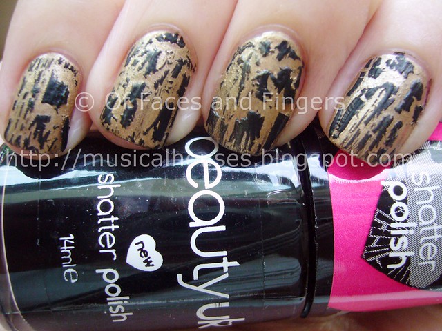
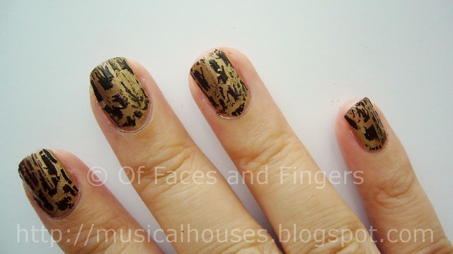
First of all, let's take a look at Goth. This is a pure black, simple as that. Here it is over another drugstore brand, Collection 2000 Aztec Gold. I rather like this combination!
beautyuk shatter polish goth


One of the things I found when applying Goth was that it really shatters into tiny bits, thus displaying very prominently the colour underneath. So if you would like the under-colour to be more visible, this is a great one to choose. However, I found it a little clumpy even in the bottle, and hard to work with. It was a little difficult to get an even coat on the nail. Still, the effect it gave was gorgeous.
beautyuk shatter polish goth 2


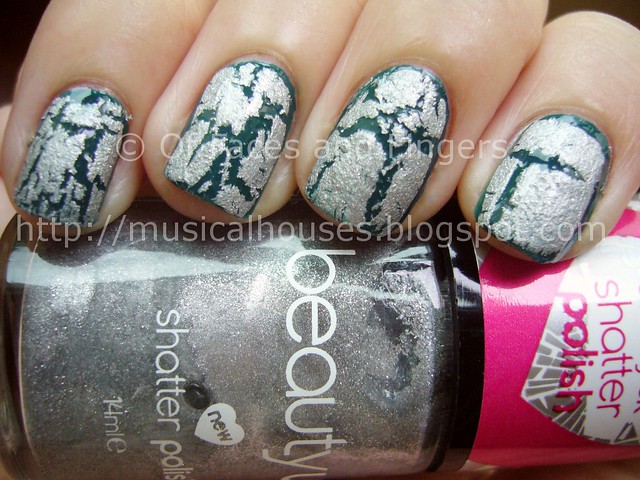
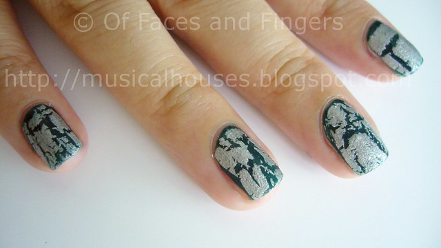
The next colour is Glam Rock, which is silver foil. I was so excited for this, as the large majority of matte polishes up to now have been mattes, so it was great to see them come in other finishes! Here it is over Boots No. 7 Totally Teal. I love how the deep teal base makes the silver just pop!
beautyuk shatter polish glam rock


Like the Goth shatter polish, I found this a little tricky to work with. However, it wasn't as lumpy as Goth for some reason, and I applied it with reasonable ease. Another thing I noticed was that this didn't "split" as much as Goth did. When I wore Goth, you could see big patches of the base colour showing through where the polish had split. Here, the gaps were much smaller, and if you apply too thick a coat, the polish won't shatter very nicely. You can see this on my index finger, where the shattering effect was pathetic as the coat was too thick. A little goes a long way with this one.
beautyuk shatter polish glam rock (2)


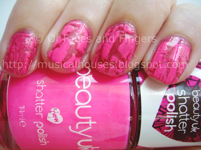
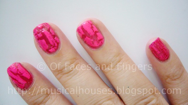
Lastly, we have Punk! I was so excited for Punk - after all, how many hot pink shatter polishes are there out there? So I just had to try this. Here it is over Wet n Wild Quartz of Course. On hindsight, maybe I could have picked a more contrasting colour to pair Punk with, but hey, it still looks gorgeous right? And I'm not sure how clear it is from the photos, but Punk is HOT NEON PINK! Woohoo! Retina-searing, breath-bating, ice-melting hot pink! Such a beauty.
beautyuk shatter polish punk


I personally felt that Punk was the easieset out of all the three polishes to apply - it wasn't lumpy in the bottle, and application was good. I had no issues with this. As you can see in the photos, it also shattered very nicely, and I didn't have big bald patches or tiny shatter lines. As with most shatter polishes, though, the thicker the coat, the larger the shatter pieces.
beautyuk shatter polish punk 2


Since I'm a huge fan of shatter polishes, I'm absolutely in love with BeautyUK's latest offerings. Goth, as your standard black shatter, has been done before by other brands, but I especially love Punk and Glam Rock, both of which are of good quality and are unique in the colours. I don't see many coloured shatters by readily avaialble drugstore brands, so these are definitely worth checking out.

(Product was sent for review. Review is my complete and honest opinion. I am not affiliated with/compensated by the company.)

Tuesday, June 21, 2011

Polka Dot Mani Fail with Essie Foot Loose

Edited to add: Get 10% off your Born Pretty Store purchase with coupon code MH10K31 - expires Oct 31, so you can purchase happily til then! (Note: I don't profit in anyway from the code. I'm just sharing it with interested readers.)

After seeing all those awesome cool manicures featuring dotting tools, I decided that despite my lack of hand-eye coordination and general clumsiness, I just HAD to try one out. That, and I wanted to bring on a summer colour on my nails. That's how I ended up with this monster of a manicure. I have to admit, while there wasn't anything wrong with the tools I used, my dotting skillz are teh suckz. Seriously.


I got my dotting tools from Born Pretty Store, which has been popular lately among bloggers and nail polish lovers for its ready availability of cheap and cheery nail art suppliers, including crackle polish, stickers, rhinestones, etc. The dotting tools I got were just under US$5 for a set, and are available here.

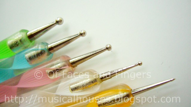
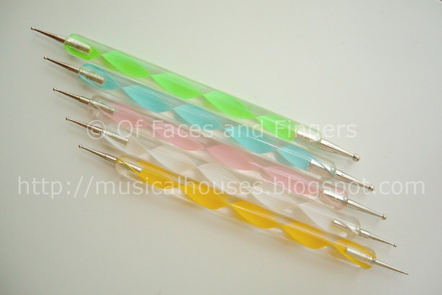
These dotting tools are of good quality, and quite handy to use. You get a set of 5 dual-ended dotting tools. All five have two ends.

dotting tool bornprettystore 1


One end is all the same size, a standard size that would be handy for most designs:

dotting tool bornprettystore 2


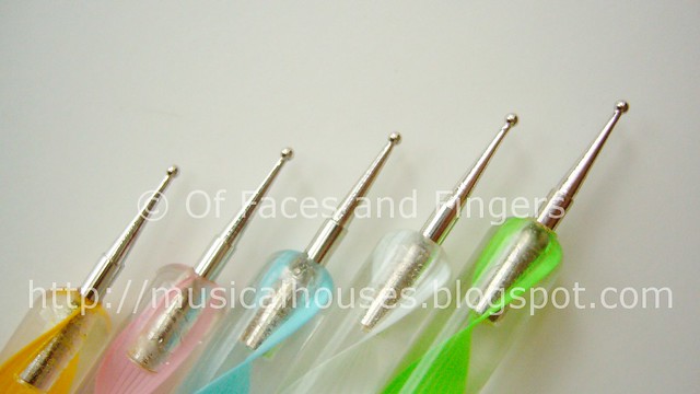
The other end of the tools is more interesting for girls who really want to dot in all sizes. The ends of the tools range from really big to positively tiny, and would definitely satisfiy any dotter's needs.

dotting tool bornprettystore 3


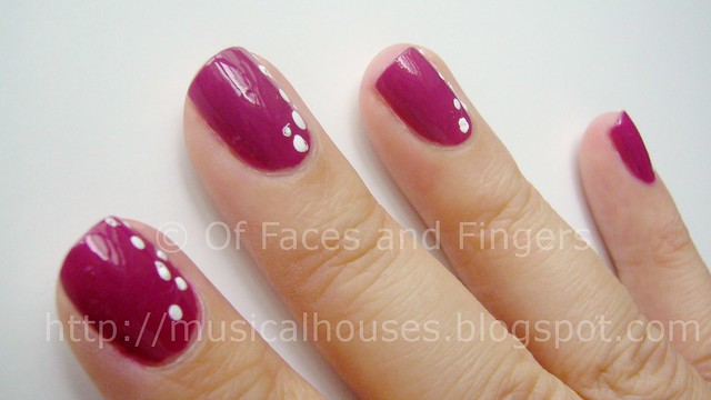
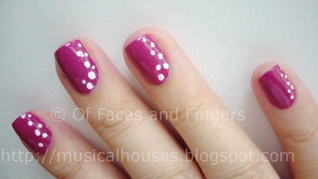
For the dot manicure below, I used Essie Foot Loose because it was such a lovely summer colour - girly, bright, and still a little spunky. And since it's in the colour family of pinks (in this case bright purply-pink), it's wearable to the office! And unlike other Essies which tend to be sheer and streaky, this is a one-to-two coater, depending on thickness of application.

essie foot loose wnw white 2


For the dots, I used the dotting tools and Wet n Wild White. One of the best white konading polishes ever, now used for dotting. FOr the variously sized dots on my nails, I used the large end of the green dotting tool, and the large end of the pink dotting tool. I also, for smaller dots, used the white dotting tool.

I know the dots don't looks as nice as they could be, but that's realy due more to my lousy application than anything else. After all, all dotting tools are the same right? But looking at these photos makes me feel like from far, they aren't THAT bad, right, right? *Crickets chirp*

essie foot loose wnw white 3


Anyway, I love the colour of my mani, even if my dotting skills suck. It kind of reminds me of summer - bright, and polka dotted, and just generally cheery!

(Dotting tools were sent for review. Review is my complete and honest opinion. I am not affiliated with/compensated by the company.)
Tuesday, February 8, 2011

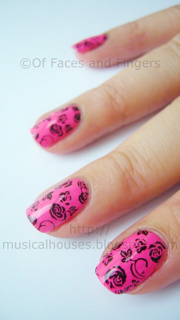
Girly Punk Valentine's Day Nails: Neon Pink and Black Roses

Nothing says girly punk like hot pink and black. And nothing says romance like roses. So when I decided to do Valentine's Day manicure, I decided to combine these two aspects, although I'm not very girly, punky, or romantic. I keep seeing all these sterotypical reds, pale pinks, and sheers coming out near Valentine's Day, and I keep thinking - why shouldn't I do something different?

So here you are: neon pink, black, and roses. The horror!

Girly punk Valentine's Day nails

To be honest, I didn't quite like my nails when I first wore them. I thought they were ugly (and I'm sure some of my readers will think they ARE ugly), but for some reason they grew on me, and I can't quite figure out why either. Maybe I got used to the ugliness. Or maybe the hot pink colour matched my funky Valentine's Day eye look. LOL. But it did grow on me, and yes, I was walking around with blinding hot pink nails with OTT rose designs. Yeeha!

funky valentine day nails 2


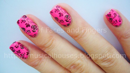
For the neon pink base, I used Eyeko Punk Polish for Neon Nails, which is a one-coater if you're careful. Like other Eyeko polishes I've used before, the consistency is a little on the thick side, so if you prefer a thinner polish consistency, one or two drops of thinner would be more than sufficient. Oh, and this polish is NEON. Like eyeball searing, highlighter pink kind of neon. I know it doesn't look like it in the photos, but that's because I just couldn't capture the blinding neon-ness of it on camera.

For the black roses, I used my favourite konading black of all time, Wet n Wild Black. It's dirt cheap (if you don't count the cost of shipping it outside of the USA), easily available, and opaque in one coat. Perfect for konading!

The konad plate used was M65. I figured I could get away with such an OTT rose design only around Valentine's Day!

funky valentine day nails 3


So this isn't your traditional Valentine's Day sweetheart manicure. But I have those too! If this is making you puke, feel free to try some other sweetheart, Valentine-appropriate posts: there's one with girly chic, a feminine pastel purple that's holo to boot, a nude with a touch of flowers, and the near classic jewel pinky-purple holo. Probably more traditionally Valentine Day-ish than this sad excuse to wear hot pink, LOL!

I'm not much of a romantic, and I really couldn't care less for Valentine's Day. But I figured, since it was the occasion for it, why not go all out in dressing up my nails? It's the perfect reason to get away with whatever I want!

(Eyeko product sent for review. Review is my complete and honest opinion. I am not affiliated with/compensated by the company.)
Sunday, October 17, 2010

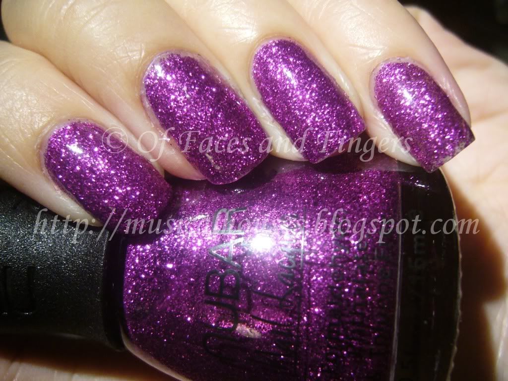
NOTD: Nubar Twilight Kiss and Revlon Grapefruit Glimmer

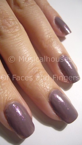
Nubar Twilight Kiss is one of those "in-between-the-season" colours - it's not too dark or dusky for summer, and it's not too light for cooler weather. And when overlayed with a sheer shimmer, I think it looks pretty good. So that's today's NOTD is! The layering polish is a really old (and probably discontinued) Revlon goodie, the Grapefruit Glimmer from their ancient Glimmer Gloss range.


Nubar Twilight Kiss is a dusky light purple, and I think it's actually a pretty colour, and quite wearable to work. I kind of think it's one of those colours you can sneak into the office. Revlon Glimmer Gloss in Grapefruit Glimmer is definitely an office colour - it's a sheer pink with very fine, faint shimmer. Honestly, it's so sheer it probably won't look like much by itself. But I think Grapefruit Glimmer has a lot of potential over darker colours.

Here, I'm trying it out over a light colour, and I think it looks quite good. Just imagine the possibilities this one has with dark colours! In fact, I think that if you layer it over a dark grey-purple, you'd get a shimmer similar to Chanel Paradoxal. I mean, it does have that similar faint sort-of-pink shimmer, no? Not identical, but close enough, perhaps?

nubar twilight kiss revlon grapefruit glimmer


Application was pretty good for both - but then again I'm partial to Nubars and Revlons, they are some of my favourite brands. The brush size, shape, texture of the polish just works for me. Lasting power is average, these lasted for about 3-4 days before chipping, which is normal for me.

nubar twilight kiss revlon grapefruit glimmer


I like Twilight Kiss well enough, but I personally think Nubar has more exciting colours (like their awesome duochrome shades). Twilight Kiss by comparison is one of their more subdued shades, although it's still pretty. And Glimmer Gloss is a great work shade for someone looking for a slightly more interesting pink sheer. Not a bad combination altogether.

Tuesday, August 31, 2010

Eyeko Chi Chi Polish and Punk Polish Swatches!

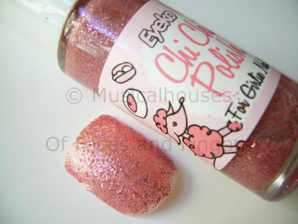
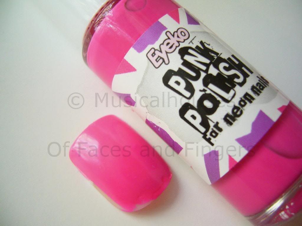
Eyeko has launched two new shades, Chi Chi Polish and Punk Polish. One's a glitter and one's a neon, but they're both pink! Punk Polish is a hot neon pink creme, while Chi Chi is a rose pink glitter in a clear base.

Eyeko Chi Chi Punk Polish

You know I'm a huge fan of swatching, but unfortunately, it so happens that I happen to already have done my nails, complete with nail stickers and bling, and it would have been difficult to remove all that to swatch two polishes. (What, you mean you haven't seen my nail bling yet? See my nail bling here. And follow me on Twitter so you don't miss my future exploits!:P ) So I swatched them on some false nails I had lying around instead. I hope you guys don't mind, I promise that real nail swatches will be up soon!

Here is Chi Chi Polish for Girly Nails:

Eyeko Chi Chi Polish

This is a not-too-dense glitter in clear base, and this was 3 coats. You'll probably need 3-4 coats for full opacity. This would probably work well for layering, because the glitter won't obscure the colour below it. As a standalone colour it's pretty, but you'll need to put more coats on. I personally love this colour, it's sweet and girly but it still packs a punch due to the glitter. It's not too boring.

Here's Punk Polish, for Neon Nails:

Eyeko Punk Polish

This is a hot pink neon shade. It's not retina-searing neon, but it's still a pretty bright hot pink nevertheless. This is a creme and it is nicely opaque in two coats. Otherwise, there's not much I can say - the pictures do all the talking, really :)

Application-wise, both of these were the usual Eyeko quality - that is to say, the texture is a bit thicker than some of the other polishes out there, but they apply quite well. And they're pretty good value for the price, too, so these are worth checking out if you like any of the colours.

(This product was sent to me for review. I am not affiliated with or compensated by the company. This review is my honest and complete opinion.)

Monday, August 2, 2010

NOTD: Nubar Petunia Sparkle: It's Freaking FUSCHIA?!

I bought Nubar's Petunia Sparkle, thinking it would look like a nice bright purple. Because that was what ALL the swatches I saw on blogs showed me. Purple. Straight-up purple. Nevermind that Nubar's own swatches showed a pink - I was thinking, bloggers don't lie, right? And they're usually much more accurate than lousy website swatches.

WRONG. In this case, all of you lied to me! :P But I don't blame you guys - it's just one of those polish that's a major PITA to photograph accurately, as I soon found out for myself.

See, when I took my photos of Petunia Sparkle, they all turned out like this:

Nubar Petunia Sparkle

Looks purple, right? That's the colour I saw in all the blog swatches I was reading, and that's the colour I thought I would get when I bought it.

But noo, it doesn't look like that at all - definitely not on me, at least. On me, it's more of a hot fuschia colour. Like, bright fuschia. Almost-neon-but-not-quite-but-still-full-of-bling fuschia.

This is how it REALLY looks like on me. And while I rarely edit my photos (I never photoshop them, although I do occasionally edit indoor photos for colour accuracy) I had to colour-edit this one picture below, because it was necessary. Despite my 2343252523 shots of Petunia Sparkle, it just kept showing up purple on my camera. But on me, it's not purple at all. It's really a lot more pink, a lot less purple, but still really hot.


See, see, see? I told you it was necessary, right? I know purples tend to photograph blue most of the time, and usually I can visually compensate for that, but somehow for this colour, it photographs so much bluer that the colour seems to be a different colour altogether! Of course it's still one hot sizzling colour - but when I bought it, I was really expecting it to be purple, not pink.

And it's really funny, because there I was thinking, "All those bloggers lied to me!" But when I tried to photograph it myself, ALL of my shots turned up purple, forcing me to resort to colour-editing. But I colour-edited them because I just wanted to show you guys what the colour really looked like on me. I don't want anyone who might buy nail polish based on my photos thinking it's a purple, because on me it's definitely fuschia!

(Before anyone starts thinking that I'm one of those bloggers who photoshops my cuticles and erases my pimples, I'd like to state my blog policy on photo-editing. My policy on photo-editing is that I do it to enhance colour accuracy, and that's it. I don't edit anything other than colour, period. I don't make my cuticles look neater, or my face look more contoured, and if you look my photos I think that's pretty obvious. It's a distinction I'd like to make clear, because I am indeed aware of the controversy that could potentially surround a post like this.)

Friday, June 18, 2010

OPI DS Extravagance: Awesome Holo Goodness

Ahem ahem *clears throat and looks awkward* Before I show off the awesome holo-ness on my nails, could you guys do me a teensy favour and vote for me? (I bet you knew that was coming..) It's a simple two-step (or one, even) process: Go HERE, and look for the girl called "Grace". Looks familiar? Umm well that's because that's me! So if you've enjoyed my blog and would love to see me swatch/review more stuff, be nice to me and click on the "Vote" button. :) You can do it once a day, but I don't imagine anyone's going to do that LOL, so I'd be happy if you just voted a couple of times. If you're really lazy, CLICKING HERE leads you directly to the voting form for me :D All you need to do is enter your email address, and you can uncheck the box if you don't want Stila's spam :P

Today's NOTD is one of my favourite holos of all time. There are some holos that are awesome because of the way they totally bring out the holo rainbow on your nails (like GOSH Holographic, from THIS POST) and there are some which have a more diffused holographic glitter - you get holo glitter bits, but not the entire holo rainbow. I usually don't fancy these types of holos, but OPI DS Extravagance is one I make an exception for.

Although the holo is a little more diffused in this one, I still love it nonetheless, and I can't quite say why. Maybe its because of its holographic sparkliness, maybe its the rich pinky-plum jewel tone that really feels extravagant (like the polish name, haha) and makes me feel like I've got little gems on my fingertips everytime I wear it, maybe it's the way it glints and winks in the sunlight. Whatever it is, I love this baby. And summertime is the perfect time to wear holos - the extra daylight just makes them so much more glitzy.

Here's two coats in natural sunlight:

OPI DS Extravagance

Application on this one was good, as good as OPI's usually get. Not streaky, opaque in two coats, and generally trouble-free. I'm personally a huge fan of OPI's Pro-Wide brush, so I love the huge brush size because it lets me do my man-hands in fewer strokes, but girls with slimmer proper ladylike hands might not fancy it so much.

Like all holographic polishes, this one was a little high maintanence and chippy. It chipped after a couple of days, which is not unusual for a holo polish. I really love this one, and it's a pity the entire DS series was limited edition. I really wanted DS Original too, but I never got to lay my greedy paws on it before it wasn't sold anymore.

Tuesday, May 25, 2010

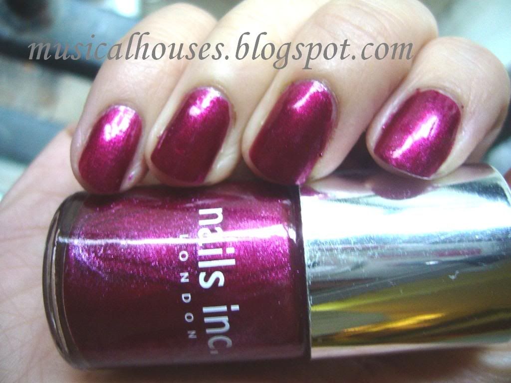
NOTD: Nails Inc Diet Coke Paris: A Lovely Berry Creme

I'm sure you already know this, but for this month, whenever you buy 2 500ml bottles of Diet Coke, you get one bottle of Nails Inc polish free, out of a choice of four colours. The colours are all named after fashionable places - London, Paris, New York, and Milan. In one of my previous posts I featured Nails Inc London, with some comparison swatches HERE, and this post I'm featuring another colour - Nails Inc Paris!

Despite being a freebie, Nails Inc Paris, as with Nails Inc London, applied beautifully, was well pigmented, and totally opaque in 2 coats. It has a lovely creme finish, as does Nails Inc London. But while Nails Inc London is a greige-y nude, Nails Inc Paris is a bright but still muted berry-toned plum creme. I really love this colour, it's perfectly in between plum and purple. It looks really delicious, it reminds me of berries and jam. Yum. Berries.

Ooh, stubby fingers:

Nails Inc Paris

And here's a picture with the bottle. I know it's blatant product advertising, but I actually think the Diet Coke logo on the bottle is kinda cute:

Nails Inc Paris Diet Coke

This is actually similar to Nails Inc Piccadilly Circus (which I used in a very unfortunate and ugly KOTD HERE). Both of them are cremes and of similar colour and depth, but I think Paris is a lot more purple than Piccadilly Circus, which is a more straightforward berry pink.

Tuesday, May 4, 2010

Orly Foil FX Rage and GOSH FrouFrou: Are They Dupes?

So the Orly Foil FX Collection, launched a couple of months back, has met with general aplomb from bloggers and nail polish lovers alike, being right on trend with its metallic take on golds, silvers and pinks. But of course, for us who aren't in the US, Orlys (is it me, or is it just that everytime I see the brand Orly I think - O RLY?!) are hard to come by, and when they are, they aren't cheap either. I know, doesn't it just make you want to cry? But I was lucky. One of my friends agreed to buy it for me and mail it here, so I have both Rage and Shine (I'm still trying to get my hands on Luxe). But not every girl could be so lucky, so I thought maybe I'd see if there isn't a dupe for it yet.

And sure enough, I found something I thought was dupey - GOSH FrouFrou! Actually, I had already done an NOTD with that colour! (Come to think of it - is it a NOTD? Or an NOTD? I know grammar rules say that if the first letter is a vowel, or has a wel sound, then it should be 'an'. So I guess since N sounds like a vowel, it should be an NOTD. But I always feel like typing 'a' because I'm seeing it in print, not hearing it in my head when I type...) Anyway, that NOTD was done waaay back when the only reader of my blog was my imaginary pet dog, but you can see it HERE. Wow, I never knew I was so ahead of the curve! Weird, I know.

Anyway the big question all my UK ladies want to know: are they indeed dupes?

Here are bottle comparison pictures:

Orly Rage Foil FX GOSH FrouFrou

L-R: Orly Rage, GOSH FrouFrou

They look pretty similar, don't they? They could be dupes!

Here are the comparison swatches:

GOSH Froufrou Orly Foil FX Rage

My index and ring fingers are Orly Rage, while middle and last fingers are GOSH FrouFrou. That means L-R: Orly Rage, GOSH FrouFrou, Orly Rage, GOSH FrouFrou

Ooh, so close, sooo close. They're not total dupes though. Although both colours are metallic foil pinks, Orly Rage is a more beige, making it a beigey-pink, while GOSH FrouFrou is pinker. But otherwise, they're entirely alike - the way they apply is similar, the finish is similar, and both are just good metallic foil-y goodness that can be worn to work despite the bling, because the colour is so innocuous.

So which one should you pick, if you somehow have access to both but only wanted one? (I think this is purely a hypothetical scenario though, since Orly is available in the US only for most part, and GOSH is only available in Europe for the most part.) Well if somehow you could buy both but only wanted one, then it would depend on your undertone, and how beige or pink you wanted your colour to be. I think the beige tinge in Orly Rage would suit warmer girls better, especially if they find GOSH FrouFrou too pink and unwearable, while the pink might work better on cooler-toned girls. I don't think it really makes that much of a difference though; both colours are neutral enough either way.

Tuesday, April 6, 2010

Nails Inc Elizabeth Street and Fitzhardinge Street Leopard Spots KOTD

Today's KOTD is using two Nails Inc colours, Elizabeth Street, and Fitzhardinge Street. I konaded using plate M57. As you can see it wasn't that great - I'm still struggling to put on a full nail design properly.

Nails Inc Elizabeth Street is a sheer-ish, pale milky pink creme, very subtle, very pretty, and work appropriate. The first coat is a little streaky, but it applies well after 2 coats, and evens out after that. Nails Inc Fitzhardinge Street is a deep, deep green that looks like black, also another creme. It looks a little more green when you konad with it, because you only use a thin layer of the polish for konading. I guess this isn't the best konading job ever - as you can see, there are patches in the leopard print.

Anyway, here is the not-that-great konad job, in natural shaded light:


I really love Nails Inc, I do believe they're just about the best polish brand I've tried out there. And I keep saying it everytime I use something from them, but I can't help it. I'm starting to have this dangerous need to collect every Nails Inc colour out there. I've always found the application and wear to be pretty good. Elizabeth Street isn't as awesome as some of the others, but it is still really decent. I suspect this relative lack of quality might be due to the fact that I got Elizabeth Street when they were giving them out free with a copy of Glamour, and maybe the free bottles aren't as good as the bottles in stores? I really wouldn't know though, it's just a guess, since all my other Nails Incs apply soooo smoothly. Fitzhardinge Street had the usual awesome Nails Inc application. This konad lasted for about 3-4 days before chipping, which is about average for me, so wear time is decent as well.

Saturday, February 27, 2010

Nails Inc Ebury Place NOTD: Attempting the Lilac Trend

You know, sometimes I really think the nail polish companies are just out to get me. They're always making the "trendy" colours of the season some colour that I think is just plain ugly, or some colour that just doesn't look good on me. Well, to be fair, there was the whole taupey-brown-purple mushroomy craze that I really liked - hellooo Sephora by OPI Metro Chic (here), Nails Inc Jermyn Street (here), and all your imitators. That one I liked. And then there was the mannequin nails trend, which while I know was boring as heck, was at least good for me (here). But for the most part, the polish companies just seem to hate me. Take the mint green trend for example, inspired by Chanel Jade (which isn't really jade colour at all, but more a mint colour) - I actually tried it out, and it looked like a pastel green puke of death on my fingers. And then now there is the LILAC trend, thanks to Color Club's Light As Air and Essie's Lilacism.

Can I tell you how much I hate those kinds of pastel lilac purples? Granted, I like them in the form of eyeshadows for some looks, but for nail polish, I just KNOW it's going to look like the pastel-purple-puke-of-death on me. But you know, I can never resist something if it's hyped up enough, and so I decided to give the trend a try. Of course, I wimped out of wearing straight up lilac, so I rooted around in my stash for something lilac, but with a tinge (okay a pretty strong tinge) of pink to it to make it less purply-pukey and more pinky-nude. And this is how I ended up with Nails Inc Ebury Place for my NOTD.

So here is my half-hearted attempt at wearing a lilac-ish shade, in the sun:


See see see? See what I mean about lilacs looking like purply death puke on my fingers? While I could certainly think of worse colours to wear, I initially felt like it made my fingers look really dirty. And not in a good way.

But anyway, I didn't have much to complain about. This was actually surpringly pigmented given that it's a light colour, especially since most light colours tend to be formulated (or mis-formulated) as sheers - as though an opaque light colour doesn't exist. Anyway, this was actually pretty much opaque in one thicker coat, although I used two out of habit. I think I might actually try konading with this someday, I think it could do. It also has a superfine silver pearl finish to it, that doesn't show up in most lights, if at all. But I think this slight pearlized finish is why this shade looks really glossy and reflective in the light.

Here is Nails Inc Ebury Place indoors. Here you can sort of see the silver pearl finish, if you squint. It's best seen in the bottle, around where the light hits:


Application on this, was, as is usual for Nails Inc, absolutely smooth and problem-free. I actually feel sorry for my fellow US girls, because it's hard for them to get their hands on Nails Inc, and they don't know what their missing. Every bottle I've had has been awesome in terms of application and consistency, with the slight exception of just one bottle, out of the many I have.

Wear time on this was also really good, as is with almost all my Nails Incs (except one). I don't know what Nails Inc puts in their polishes, but every company seriously needs to learn from them.

Anyway, I guess this didn't look THAT bad on me, although it wasn't my best colour. I feel that it's a little too cool-toned for me - it kind of really draws out the yellow in my olive undertones. The colour itself is interesting though - it's a lilac pink that looks either more lilac or more pink depending on the light. And that slight pearlized finish helps prevent it from looking too flat and uninteresting. I guess it's not a bad buy if you like these colours, and if you, like me, want to try out the lilac trend but don't dare to wear a straight up purple, this is probably a better bet for you.

Wednesday, February 10, 2010

Nails Inc Fulham Road and Piccadilly Circus KOTD: Annoying V-Day KOTD!

I'm not really a girly girl. I don't have a fondness for cutsey things, I HATE wearing pink, and I hate pink nail polish in general (which is really odd, considering that I'm one of the more colour-conservative nail bloggers out there). And I'm not that feminine in general. So obviously it must have been the effects of too much stress (or pear cider) that influenced me to do this:


I know, I know. The overwhelming pinkness and girly-ness of this KOTD really makes me want to puke too. But Valentines Day is coming up soon, I figure why not? Much as I think Valentine's Day is overcommercialized, and you shouldn't wait until Valentine's Day to show appreciation, etc etc etc, I have to admit, pink and roses is quite in the spirit of things. And I love trying out new things, even if it's something like pink polish with a KOTD of roses. (Now I'm not sure if that's me or the stress - or cider - talking.)

Anyway, the base is Nails Inc Fulham Road (NOT 80 Fulham Road, which is a totally different colour altogether), and the roses are Nails Inc Piccadilly Circus. And the konad plate is M65 really like both colours, although maybe to use them both together with the rose konading pattern wasn't the best idea ever.

Fulham Road is a very pretty frosty pink, with a hint of lilac. I think it's a good wearable way to take on the lilac trend that seems to be going on now, especially for warmer-toned girls who don't look good in deathly pale pastel purples. I swear the nail polish companies are just ganging up against me by releasing nail trends that don't suit me. First it was the death-hand inducing mint green, and now it's death-hand inducing lilac (thanks a lot, Essie Lilacism). But this one is more pink and less purple, and quite pretty. It has a really interesting purplish sheen to it that's unfortunately lost on the nails, so sadly it just looks pink on. But I still like it quite a lot, and it's not OTT frosty either, so you could probably get away with this at work. This one is a little sheer, but it reaches pretty good opacity in 2 coats, although if you want to really completely cover everything, you'll need 3. In this photo I'm using 2 coats.

And Nails inc Piccadilly Circus is a beautiful deep pinky-red creme. I really love this one. It's a lovely colour that works for all seasons, and I think this is pretty much the kind of colour you could wear all the way from Spring to Autumn, especially with the trend of bright nail polish going on right now (China Glaze Up and Away, anyone? I'm still wiping the drool off my mouth for that collection). So this one is really pretty and versatile. It's also a good way to wear something that is as statement-making as red nail polish, without actually having to wear straight up red, which some people might not like wearing. This one is a beauty, and is opaque in 1 coat.

And of course, both Piccadilly Circus and Fulham Road have that beautiful unsurpassable Nails Inc application - flawless and requiring almost no clean-up. I really love Nails Inc..despite the unwieldy cap on the polishes, they've done everything right. I love the consistency, the opacity, the brush, and the drying time (not that fast, certainly not as fast as GOSH, but definitely decent). In general, I just have much love for them, even if they're certainly not cheap.

So there you have it, the official worst Valentine's KOTD ever. But I thought I'd put it up anyway, because why waste a perfectly good KOTD, when you can put it up in a puke-inducing post right? :P

Monday, January 25, 2010

Nails Inc Half Moon Street and $OPI Absinthe Makes the Heart: My Nails are Nubbins!

The main reason why I hate travelling is because it ruins my nails. (I know, I have a problem.) This is what happened after a 12-14 hour flight:

Nails Inc Half Moon Street

Just to compare, this is how they were before the flight (they were longer, but I was waiting for them to grow out a lil more before I filed them into the right shape, hence the uneveness in length and shape):

Sephora by OPI Absinthe Makes the Heart

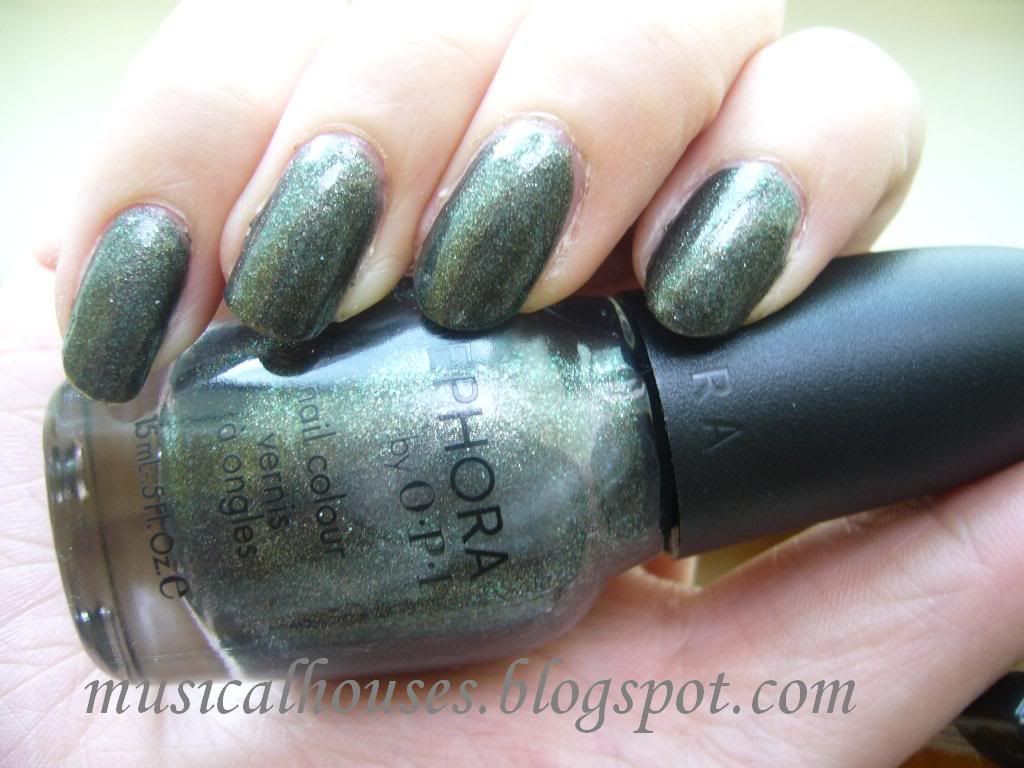
That NOTD was $OPI Absinthe Makes the Heart. That one I love. I don't normally like greens, because I'm a colour wimp, but I LOVE this one. It's a greyish green - or a greenish grey - with super cool foil effect, and a good amount of glitter. I really love how it looks, and I think it would look cool with a matte topcoat over it too. Somehow, my skintone seems to draw out the extreme colour possibilities in it - on me, sometimes it even looks positively emerald green, while other times it looks like a metallic gunmetal grey. I really like this one. It's like, deep, jewelled green with tons of grey. Cool. It applied a little sheer, so this is 3 coats. 2 would have covered most areas, but I wanted to cover everything.

Anyway, back to the sad state of my travel-worn nubbins. They're all short and uneven now. I'm hoping they'll grow out soon. It just makes me want to cry, because that was 3.5 weeks of growing out my nails down the drain (yes, my nails grow slower than snails move, and they break and peel, so that was my record length so far). If only there was a way to travel that wouldn't ruin my nails...I'd love travelling so much more.

But since I'm all stuck with short nails for however long they take to grow out, I'm going to wear all the bold and vampy colours I can while the nubbins last. So, you know, the next few NOTDs are going to be bold and dark! No more nudes!

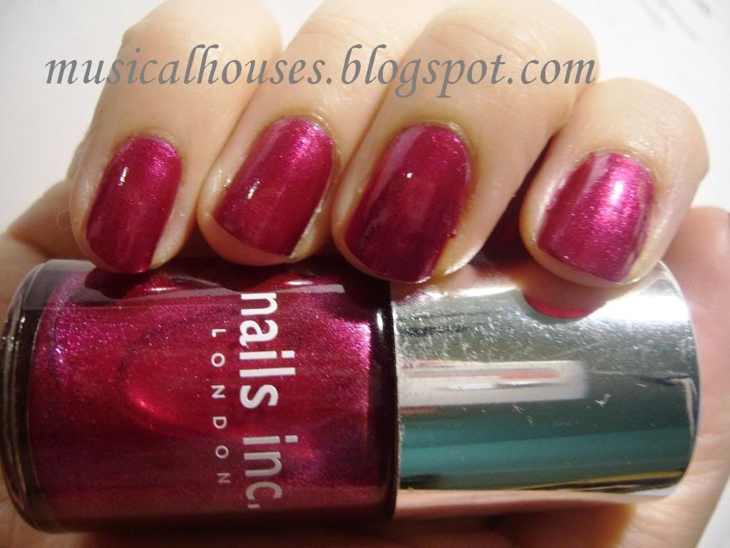
So for now, my mani is Nails Inc Half Moon Street. This is an exclusive I believe, but I cant remember what exactly it was exclusive to. I believe it was one of those "Wow-you've-spent-so-much-money-on-our-stuff-so-here's-a-little-something-for-you" free gifts they give you if you place a big order on their website, which would absolutely explain how and why I have it. Its also very beautiful. It's a glowy magenta-pinky-red type of colour, with a lit-from within look, and a finish that defies description. I'd call it a shimmer with a metallic leaning. It has superfine silver shimmer that shows up as a sort of metallic glow. Very lovely. I don't really like bright pinks in general, but this one really has me staring at it all day long.

Application, as is usual for Nails Inc, was a dream. This one was very pigmented and smooth. I did two coats, although if I had better skills I could have gotten away with one coat. Love this one.

Here it is in artificial light, and you can see the shimmer in greater detail here:

Nails Inc Half Moon Street

And because I do so love this colour, here is a close-up shot of my nails. Take a look at the glowy goodness emanating from this thing!

Nails Inc Half Moon Street

I'm really starting to like Nails Inc a lot. With the exception of Elizabeth Street which was a dud (and I'm thinking it may be a dud because it was the free polish that came with Glamour Mag, and maybe they cut corners for the freebie), every Nails Inc polish I've tried has been nothing short of fabulous. The only thing is, most of their interesting colours tend to be exclusives, leaving the permanent line of colours a little dull. They've only just started coming out with mattes, months after all the big players have made their moves, and they've yet to come out with a duochrome, a flakie, or a holo. Awww come on, Nails Inc, I'm tired of waiting already!

And since we're hurrying the world along, while we're at it, let's tell my nubbins to hurry up and grow out! I'm waiting! And my polish stash is waiting!

Bookmark and Share

Tuesday, December 22, 2009

Complete Sleek Blush Swatches

Today, we will be swatching and reviewing Sleek's entire line of blushes. That isn't very hard, because there are only 5 of them. Nevertheless, there are, as usual, some hits and misses.

First off, here are the swatches:


L - R: Pixie Pink, Flamingo, Sahara, Flushed, Coral

Pixie Pink is a matte pale baby pink, this one took a bit of building up to get the color intensity seen in the swatch. It's pretty much a very neutral pink, although I'm tempted to say it leans to the cool side just a tad. I'm guessing this one will be popular with the paler girls, who might find the other colours too intense for them. I'd say this is pretty much your universal pink, although I do imagine that it could potentially look chalky on darker skins. I like this colour, but it doesn't excite me for some reason - I mean, doesn't every other brand have their universal matte light pink? It's boring, but I guess it's a basic colour you have to have in your stash.

Flamingo is probably easily my favourite of the bunch. This one had good pigmentation, and I really like the colour. It's a peachy-pinky colour with a bit of red to give it that extra oomph, setting it apart from it's fellow peachy-pinks like NARS Orgasm. This one had a bit of gold shimmer in it, but I really like the dimension that gives. And the fact that this is my favourite says a lot, because I didn't even like NARS Orgasm. Anyway, I have a hard time deciding whether this is cool or warm, so I'm just going to say it's neutral. I do imagine Flamingo could be used on everyone, and I really really like it a lot.

Sahara is a rather orangey bronzed browned colour, and I'm having trouble picturing who would wear it, because it really leans very orangey on me (maybe it's just my colouring that pulls out the orange or something). It's very heavily orange and brown, even in the pan. This one is matte. Obviously, this isn't my favourite colour-wise, but someone else might like it.

Flushed is a red-berry colour, with just a bit of brown, and it sort of reminds me of a sort-of NARS Outlaw or Exhibit A, as it is sort of in the same colour family. I also really like this one, and with careful use it could probably work on most people, the emphasis being on 'with careful use'. I'd say this colour is a neutral, although it does lean a little to the warm side.

Coral isn't really coral at all, but a browned orangey red colour. I know the swatches make Flushed and Coral look similar but they really aren't (@#%@#% camera). Coral is a good bit browner, and a good bit warmer, and a good bit more orange, Once again, this isn't really one of my favourites, because of the inordinate amount of orange in it, although it has less orange than Sahara. This is definitely warm toned.

In general Sleek blushes had a pretty decent quality - they weren't fantastic and rivalling the high end brands, but they were certainly good for drugsore quality. In general, the lighter colours tended to be weaker in pigmentation than the darker colours, and Pixie Pink in particular was a bit weaker in pigmentation than the rest of the colours. Texture-wise, these felt alright. A couple of the testers were on the hard side, but most of them felt pretty decent. The packaging of these is quite cute, especially if you like NARS. These are packed in NARs-esque packaging, complete with black rubber case and little mirror inside, and rectangular pan of blush with no brush. I probably wouldn't rush out to collect these, but I do like the look of Flamingo.

On another note, Christmas is coming! Merry Christmas everyone!

Sunday, December 20, 2009

Pink Bling! GOSH FrouFrou: NOTD

This is another great NOTD! GOSH Froufrou:

Here's my NOTD swatch, and as usual pardon the general lack of skills and pre-clean-up state of my nails:

GOSH FrouFrou nail polish NOTD

I really love this colour because it's such a great pink, and it goes with everything, but it's far from boringly neutral. In fact, this is really bling, without crossing the line and becoming tacky or overly blingy (although I'm pretty sure some people would tell me that there's no such thing as over-blinged when it comes to polish!). I believe it is many flecks of small light pink glitter suspended in a clear base, but the pink flecks are so numerous and so tiny that when you put it on your nail it gives the illusion of having pink nail polish that's glittery or frosty. Really cool. If you want your nail to be totally covered, 3 coats would probably be optimal, but this is 2 coats - as you can see, the glitter is dense enough to cover almost all the nail, but if you look closely you can still see some bald spots where the glitter didn't cover, but the spots aren't visible from far away though. I'd hesitate at calling work safe though - this could probably pass in some environments, but its glittery nature makes it a bit hard to pass off in a really stern office environment, even if the base colour is inoffensive and neutral.

And as usual, this one has the ridiculously-fast-drying quality that all the GOSH polishes I've encountered seem to have. I also had no application problems with this. I'm really starting to like GOSH a lot for nail polishes.

Speaking of nail polishes, tomorrow I will give you a nail polish comparison post, like I promised yesterday. I'm comparing the various nude/beige polishes I have, so stay tuned! :)