Wednesday, February 10, 2010

Nails Inc Fulham Road and Piccadilly Circus KOTD: Annoying V-Day KOTD!

I'm not really a girly girl. I don't have a fondness for cutsey things, I HATE wearing pink, and I hate pink nail polish in general (which is really odd, considering that I'm one of the more colour-conservative nail bloggers out there). And I'm not that feminine in general. So obviously it must have been the effects of too much stress (or pear cider) that influenced me to do this:


I know, I know. The overwhelming pinkness and girly-ness of this KOTD really makes me want to puke too. But Valentines Day is coming up soon, I figure why not? Much as I think Valentine's Day is overcommercialized, and you shouldn't wait until Valentine's Day to show appreciation, etc etc etc, I have to admit, pink and roses is quite in the spirit of things. And I love trying out new things, even if it's something like pink polish with a KOTD of roses. (Now I'm not sure if that's me or the stress - or cider - talking.)

Anyway, the base is Nails Inc Fulham Road (NOT 80 Fulham Road, which is a totally different colour altogether), and the roses are Nails Inc Piccadilly Circus. And the konad plate is M65 really like both colours, although maybe to use them both together with the rose konading pattern wasn't the best idea ever.

Fulham Road is a very pretty frosty pink, with a hint of lilac. I think it's a good wearable way to take on the lilac trend that seems to be going on now, especially for warmer-toned girls who don't look good in deathly pale pastel purples. I swear the nail polish companies are just ganging up against me by releasing nail trends that don't suit me. First it was the death-hand inducing mint green, and now it's death-hand inducing lilac (thanks a lot, Essie Lilacism). But this one is more pink and less purple, and quite pretty. It has a really interesting purplish sheen to it that's unfortunately lost on the nails, so sadly it just looks pink on. But I still like it quite a lot, and it's not OTT frosty either, so you could probably get away with this at work. This one is a little sheer, but it reaches pretty good opacity in 2 coats, although if you want to really completely cover everything, you'll need 3. In this photo I'm using 2 coats.

And Nails inc Piccadilly Circus is a beautiful deep pinky-red creme. I really love this one. It's a lovely colour that works for all seasons, and I think this is pretty much the kind of colour you could wear all the way from Spring to Autumn, especially with the trend of bright nail polish going on right now (China Glaze Up and Away, anyone? I'm still wiping the drool off my mouth for that collection). So this one is really pretty and versatile. It's also a good way to wear something that is as statement-making as red nail polish, without actually having to wear straight up red, which some people might not like wearing. This one is a beauty, and is opaque in 1 coat.

And of course, both Piccadilly Circus and Fulham Road have that beautiful unsurpassable Nails Inc application - flawless and requiring almost no clean-up. I really love Nails Inc..despite the unwieldy cap on the polishes, they've done everything right. I love the consistency, the opacity, the brush, and the drying time (not that fast, certainly not as fast as GOSH, but definitely decent). In general, I just have much love for them, even if they're certainly not cheap.

So there you have it, the official worst Valentine's KOTD ever. But I thought I'd put it up anyway, because why waste a perfectly good KOTD, when you can put it up in a puke-inducing post right? :P

Tuesday, February 9, 2010

My New Blog!! Yayyy Meeee!

Hi everyone!! This is my first beauty blog! Im excited! I have so much ahead of my journey as a MUA! I started this blog to continue to promote my business. I will be adding new pics soon and also just general everyday things that I run across. I like to do alot of comparison shopping on make up and beauty finds. So please stick around and stay tuned. Plenty more to come. Thanks again for stopping by! Muahhhhh:)

Barry M Lip Paints Swatches Part 2

Welcome readers, to part 2 of 4 of our (almost) complete swatches of Barry M Lip Paints (part one is here. Yesterday, we took a look at some of the orange and corals in the line, today, we're looking at pinks. Today's lipsticks are also more wearable as they are a little less pigmented and more sheer, just by a little. I also realized that although my Superdrug didn't list the colour names, the Barry M website does, so I updated my blog post. I'm a bit too lazy to update my pics, but I'll get around to that eventually.

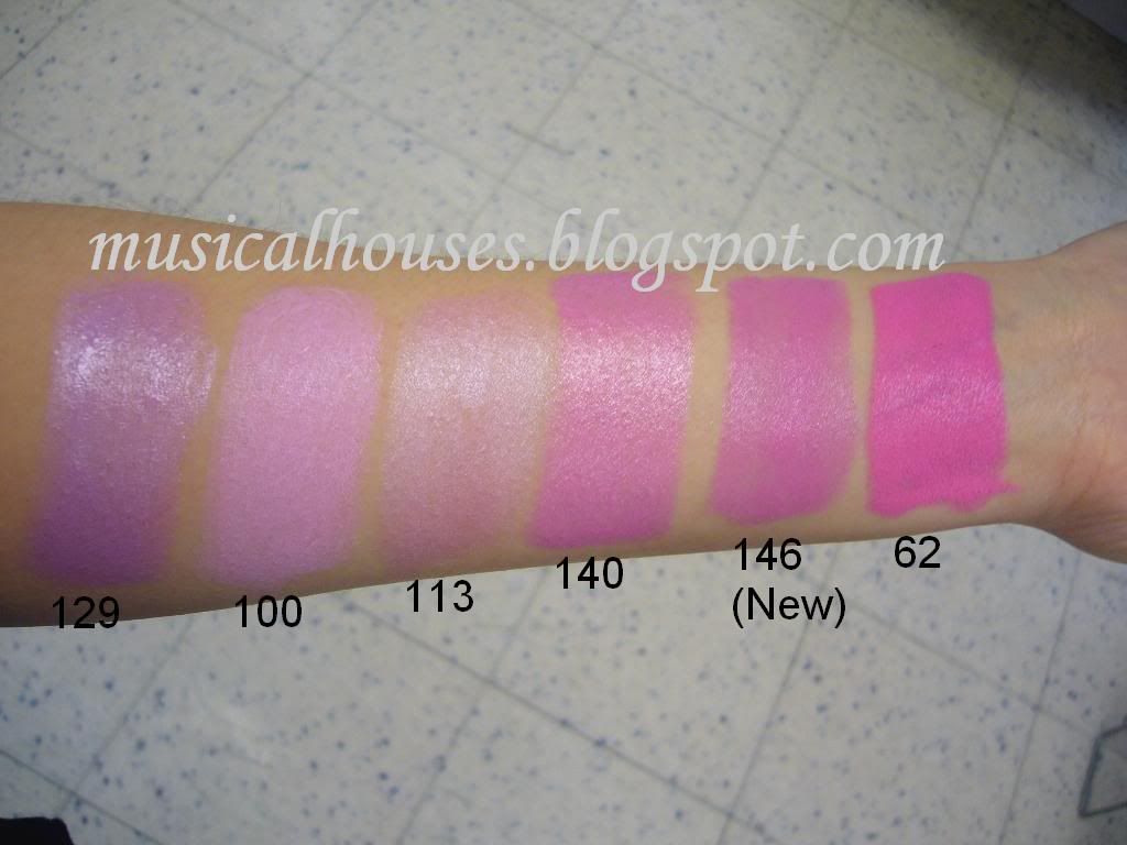
First off, here are swatches:

Barry M Lip Paints

L - R: Palest Lavender 129 , Baby Pink 100, Sheer Pink 113, Pink Sparkle 140, Dolly Pink 146 (New), Vibrant Pink 62

Palest Lavender 129 is a purple lilac colour, and is another one of those 'artistry' colours. However it does remind me a bit of MAC's Lavender Whip that was released to huge fanfare awhile back. I'll admit - I hated the MAC, and I'm not a fan of this one etiher. But if you liked Lavender Whip, this is for you. It's also made a bit more wearable by being one of the sheerer lipsticks in the line - unlike most of the other lip paints, which really 'paint' your lips, I had to build up the swatch for this one. So it isn't as bad as it looks. It probably isn't any more unwearable than Lavender Whip.

Baby Pink 100 is a pale bright pastel pink. Once again, this is one of those like-it-or-not colours, and I think those who liked MAC's Snob will love this. Because of the purple inherent in the colour, this is definitely a cool-toned colour.

Sheer Pink 113 is a toned down version of 100, and is probably 100 for the rest of us. First off, its a little less white and pale than 100. Secondly it's also more sheer - as you can see I had to build the swatch up, and even then it didn't photograph that well. This one would be more wearable, especially if layered with a darker colour.

Pink Sparkle 140, Dolly Pink 146 (New) and Vibrant Pink 62 all remind me of MAC's St Germain lipstick, or other similar colours. If you liked those, you'll love these. They're all in the same colour family of lavender pinks, but they kind of form a gradient of shades within that colour family. 140 and 146 are both lighter and more purple than 62, which is really a hot, hot, opaque pink, and 146 is a bit brighter than 140. 140 and 146 are also both sheer than 62, although not as sheer as 113. I guess these shades form a 'gradient of daring' colour-wise. For those who want the full package, 62 is a good bet. For those who are just tentatively dipping toes into the water, 140 or 146 might be great, and for those who are terrified but curious, 113 might ease you into the lavender pink family better. I have to say though, 62 is pretty neon, and it has the eye-searing quality of a good neon lipstick. It's also REALLY opaque and pigmented. You have been warned!

As usual, all of these lip paints are mostly highly pigmented, with a texture that's a little on the dry side, and which I compared to MAC's Satin finish in the last post, although the Barry M's might have more drag. Honestly, becuase they're so pigmented and not that emollient, it kind of feels like I'm swatching little sticks of foundation rather than lipsticks!

That's it for today! Next time, we'll look at more pinks, but also some berries and reds.